VV Constructions
Constructions & Ineriors
Project Overview
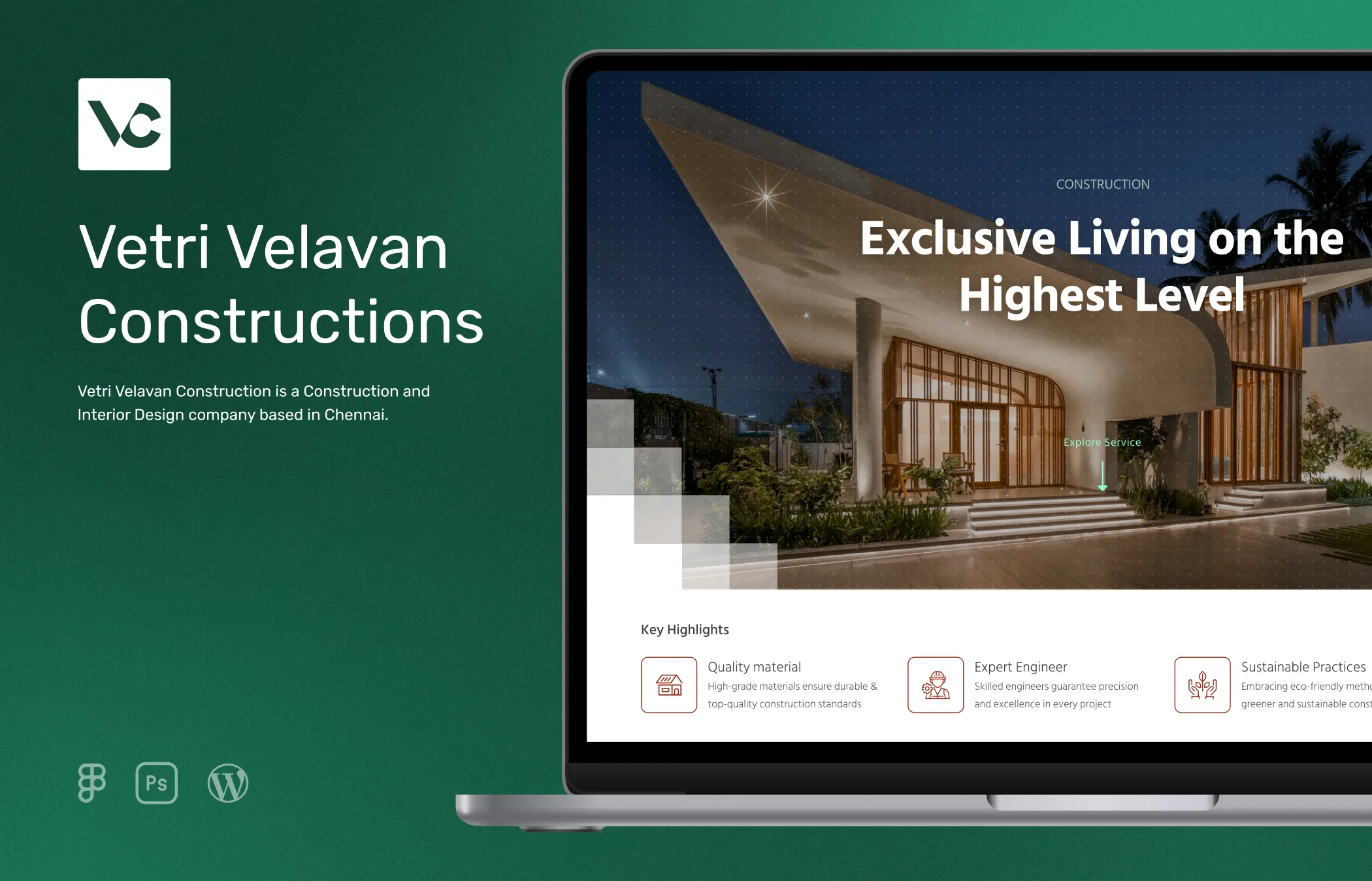
VV Constructions wanted a sophisticated online website to showcase their impressive portfolio and services, with the goal of expanding their client base and securing new projects. My role was to craft a sleek and professional website that authentically represents the personality of their brand.
By highlighting their projects with vivid imagery and compelling videos, the website serves as a tool for engaging potential customers and converting leads.
Role
UI Designer and Developer
Tools






Research
In the initial phase of the project, I conducted comprehensive research to gain valuable insights into the target market of above average income households, particularly focusing on first time homebuyers. Analyzing demographic data and market trends for the target region (which is Chennai), I identified key preferences and pain points to inform my design strategy. Additionally, I researched competitor websites to benchmark industry standards and uncover areas for improvement.
To gather detailed insights, I utilized tools such as Similarweb, ahrefs, etc., for exploring competitor performance metrics and demographic data. This allowed me to identify emerging trends and refine my approach accordingly.
I leveraged platforms like Dribbble and Behance, as well as Pinterest, to gather inspiration for our UI design, ensuring a visually appealing and intuitive user experience.
Competitor Analysis
In order to gain valuable insights and inspiration, I analyzed the websites of several competitors within our target market. Beginning with an initial list provided by the client, I expanded my research to identify additional similar companies, compiling a comprehensive list of competitors.
I conducted a detailed examination of each competitor's website, analyzing their content sections and overall structure. Throughout this process, I noted any issues or areas for improvement observed on each site. This thorough enhanced my understanding of the market landscape, providing valuable insights into prevailing trends and customer preferences.
These insights served as a solid foundation for devising tailored strategies to enhance the effectiveness and competitiveness of our client's website.
Existing Problems
Through analysis of the gathered data, I pinpointed key areas for improvement, particularly in comparison to established industry players. One common issue observed among well-known companies was the lack of comprehensive details on their websites, often limited to minimal images and basic contact forms. While this minimalist approach may suffice for larger corporations, it fails to instill confidence in newer or smaller companies, where potential customers seek more transparency and information.
Another notable issue I discovered was that many competitors offered cost calculators on their websites. However, these tools were often complicated to use and filled with technical language, making them challenging for our target audience, especially first-time homebuyers.
Solutions
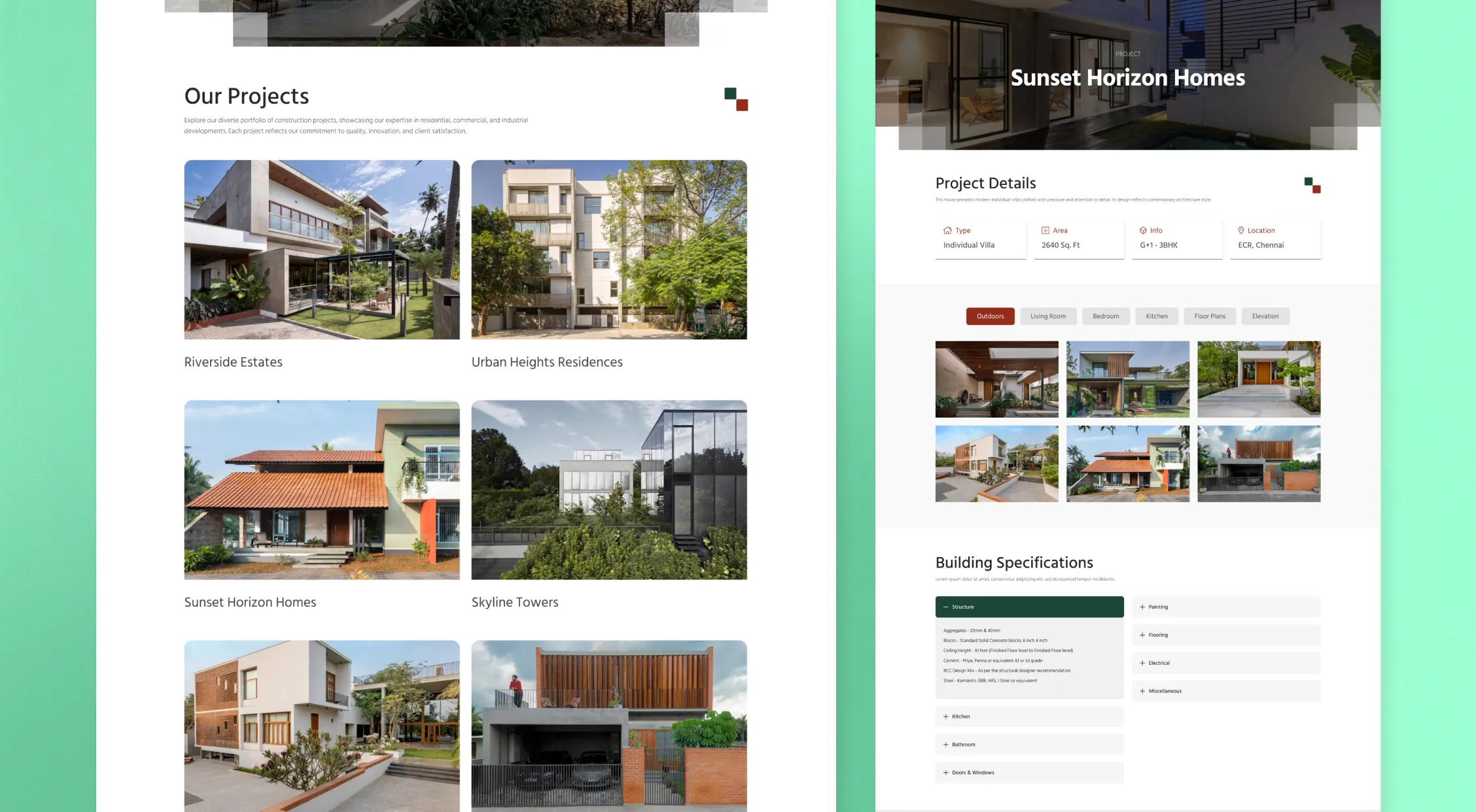
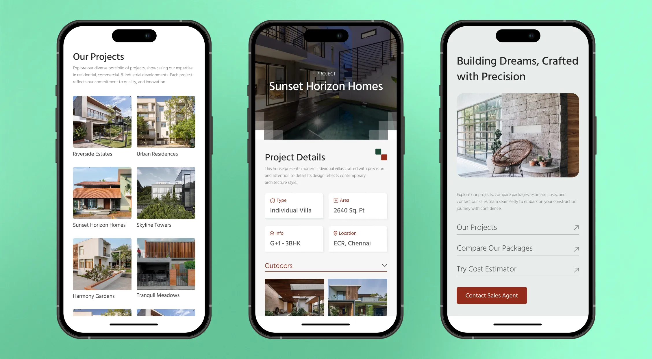
To address this issues, I proposed enhancing the 'Projects' page with extensive details about the projects and a diverse array of images showcasing construction sites at various stages, from initial plot images to the finished property. This comprehensive presentation aimed to provide visitors with a deeper understanding of the company's capabilities and past projects, fostering trust and credibility.
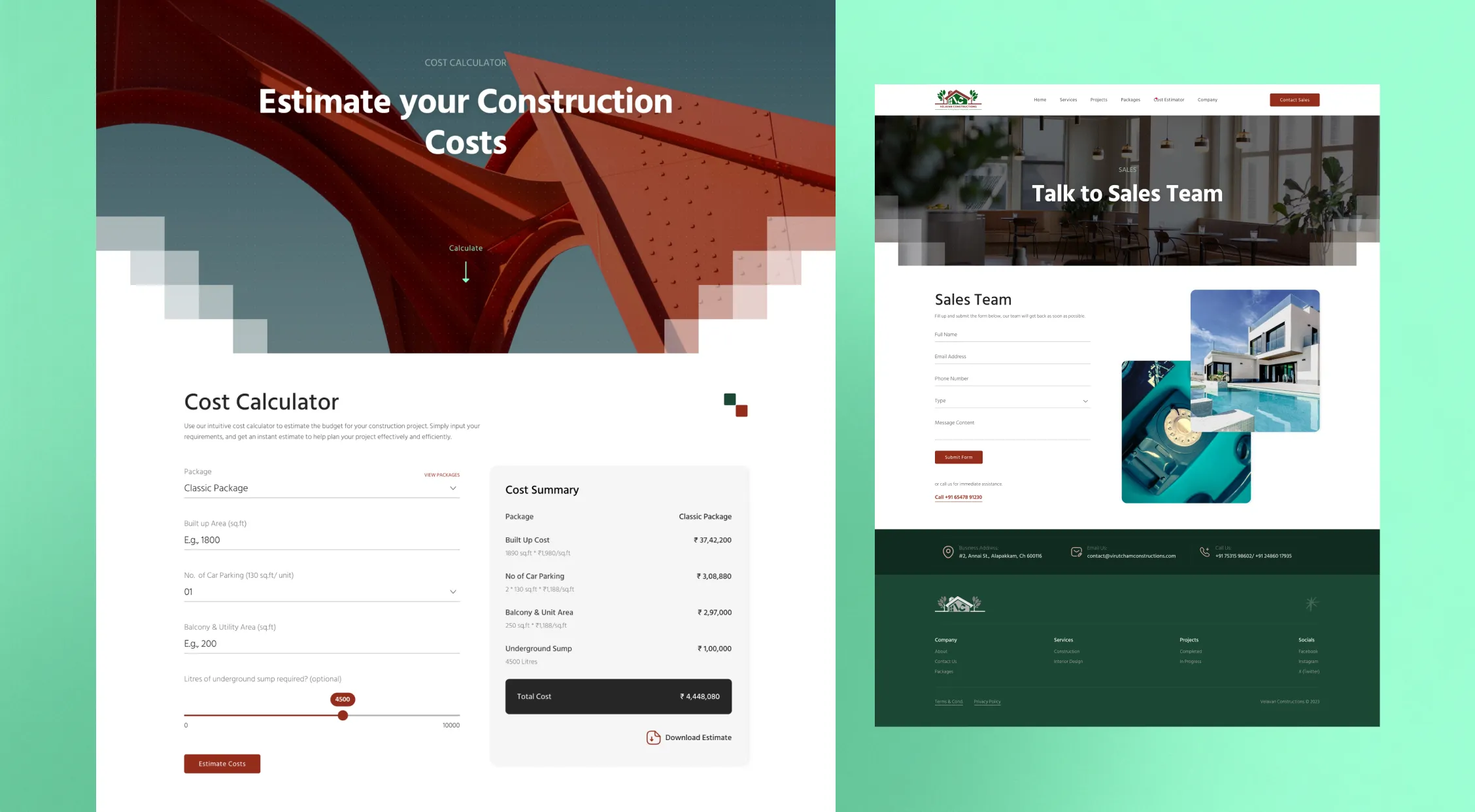
To address this challenge, I proposed developing a user-friendly cost calculator tool tailored to the needs of our target audience. This tool would feature a simplified interface and clear, understandable language, ensuring accessibility for first-time homebuyers and enhancing their overall experience on the website.
Additionally, I wanted to have helpful tooltips alongside complex terms using image as reference would further simplify the process, empowering users to make informed decisions confidently. Also wanted to give the users the ability to download the generated quote would help the user and also increase brand awarness when it gets shared with others.
Project Goals
Based on the observed data and discussions with my client, we established the following goals
- Implement visually appealing banners and hero sections to improve navigation and showcase services effectively.
- Develop detailed project pages with key project details, including images and videos, to provide comprehensive information to visitors.
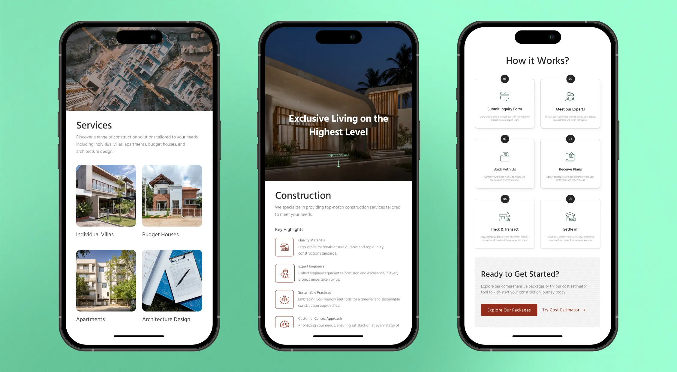
- Optimize the website to be super responsive on mobile and tablet devices to improve accessibility and user experience across all platforms.
- Introduce easy-to-use calculators for quick and accurate quote generation, catering to the needs of potential customers.
- Enable users to download quotes in PDF format with branding elements and links to the website for further engagement and reference.
Working Process
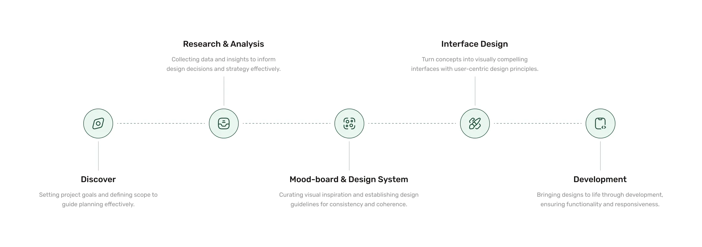
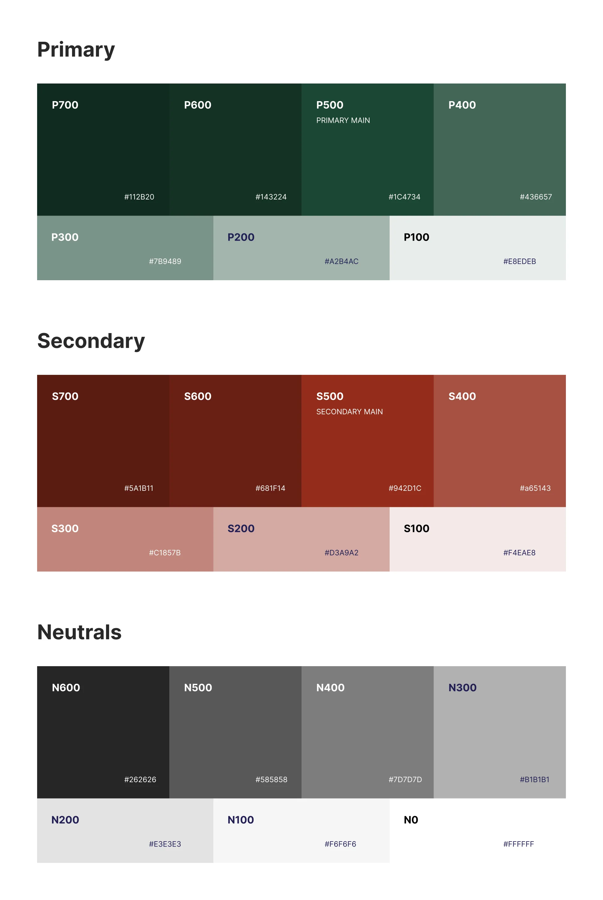
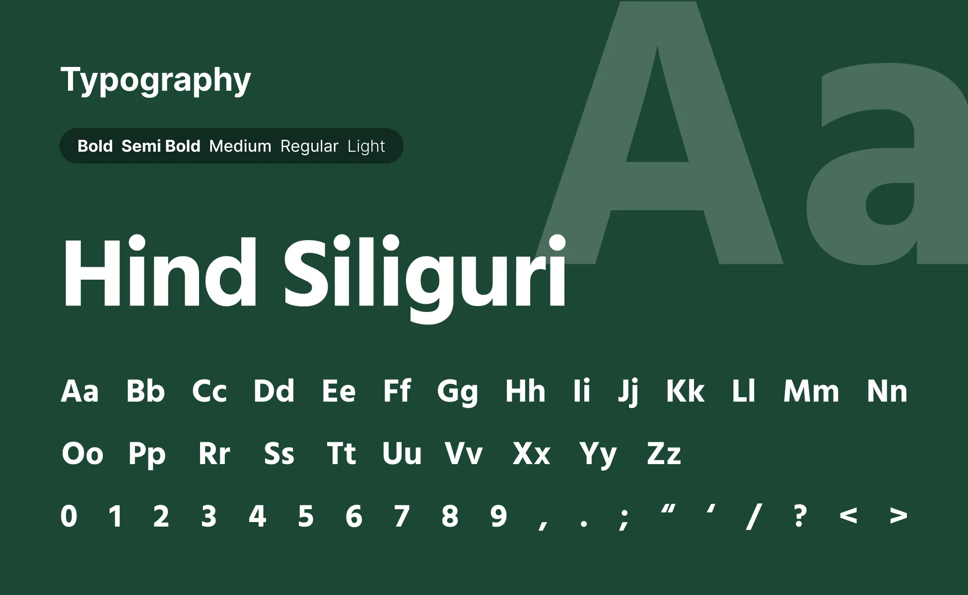
After finalizing the project goals, I initiated the process by crafting a moodboard and establishing the basic design system to start with like colors, typography, and buttons etc. Then, I proceeded to design screens and reusable components one by one.
Upon completing the designs for all pages, I presented it to my client. Based of the client feedback I incorporated few minor changes then I moved to develop the created design.
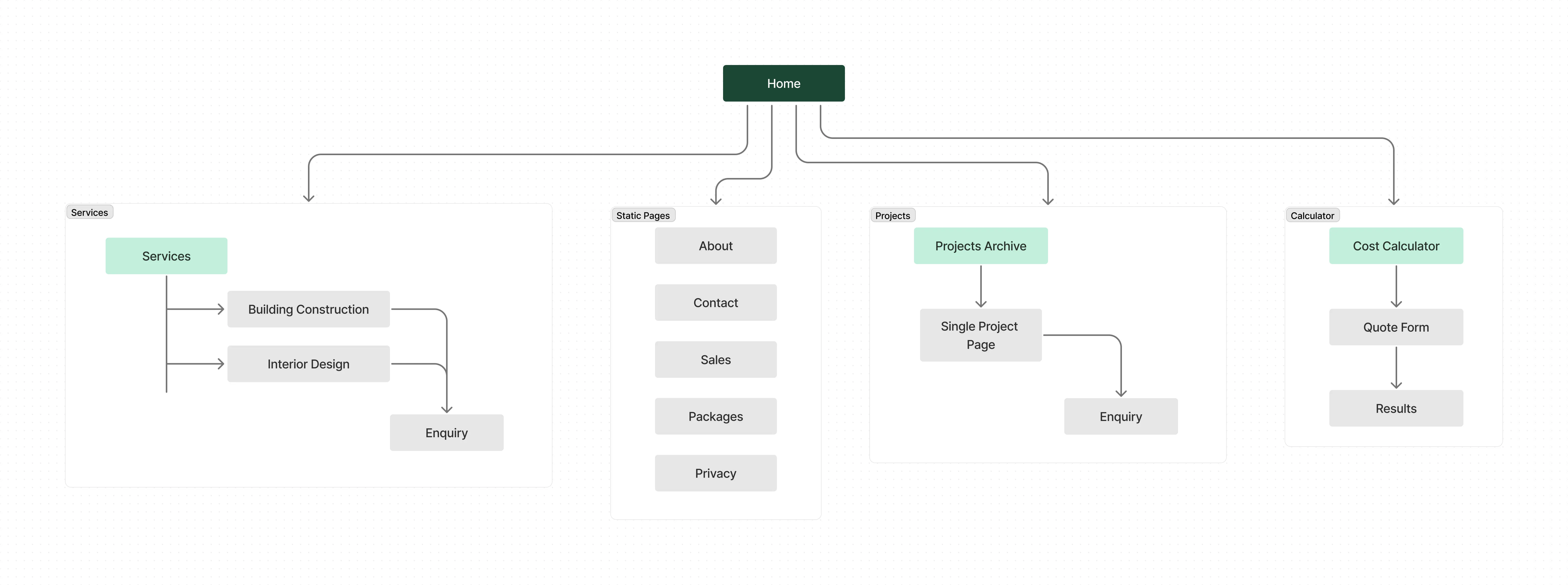
Sitemap
Representation of this website's structure and organization, outlining the hierarchy and navigation flow of pages and content.
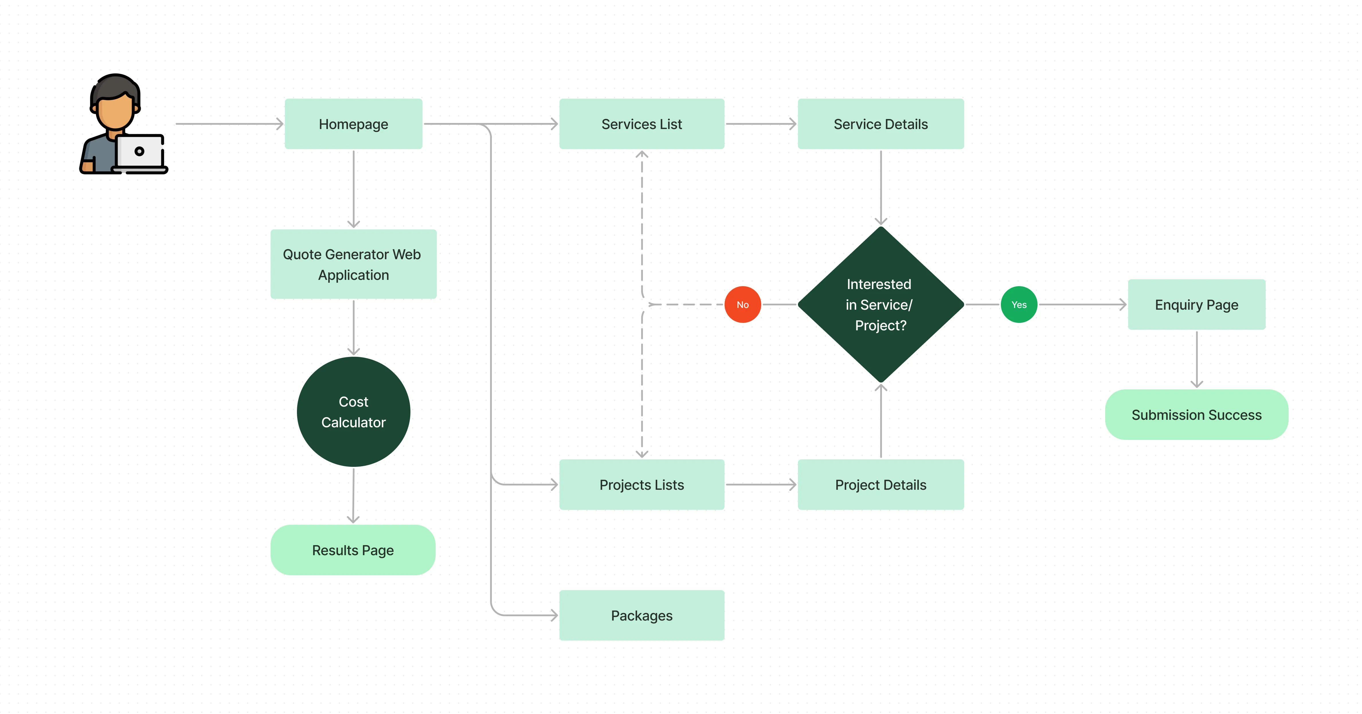
User Flow
Here is a representation of the user's journey and interactions to accomplish tasks on this website.
UI Design
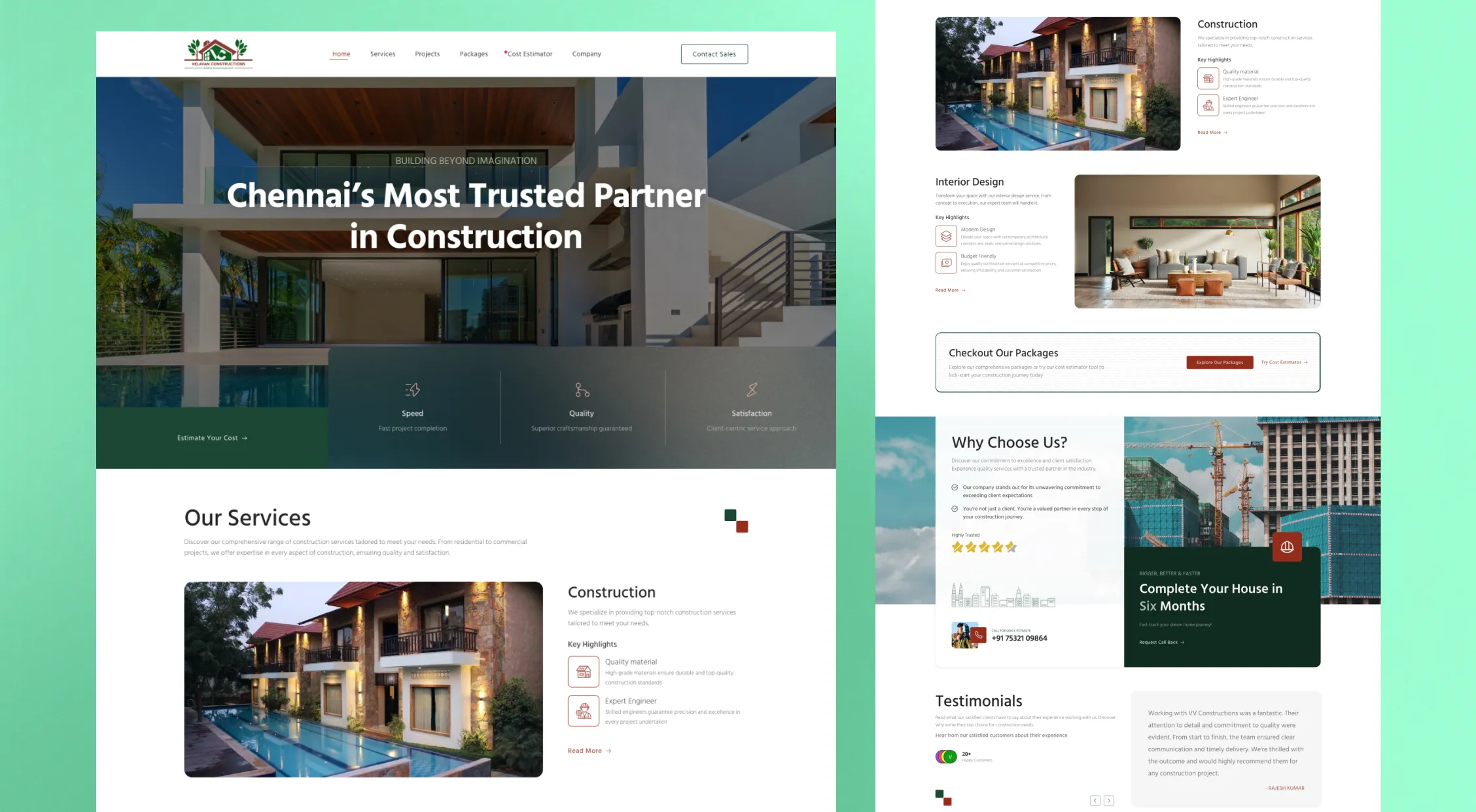
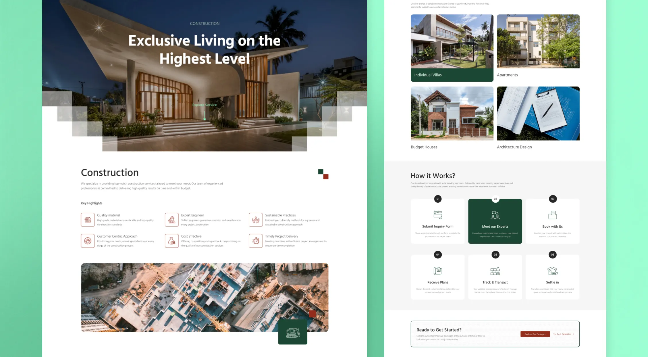
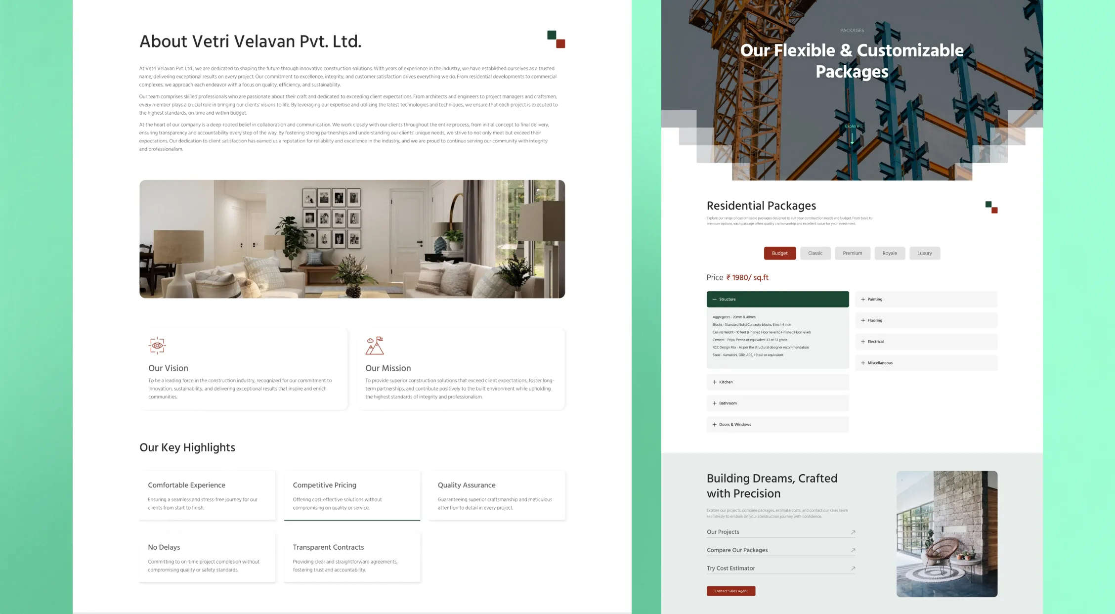
I present you the style guide and some screenshots of various parts of the website.

Website Screenshots
Development
I deceided to build the website using WordPress. I started with a boilerplate theme due to its flexibility and utilized Elementor builder for developing pages and elements. I employed custom HTML, CSS, and JavaScript to create cost calculator functionality.
Finally, I chose Ubuntu 22.04 LTS OS on the Google Cloud Platform for hosting. For security, I integrated SSL using Let's Encrypt. Additionally, I installed SMTP plugins to enable email communication before handing over the project to the client.
Go to Visuals
