The Curate
Men's Fashion Brand
Project Overview
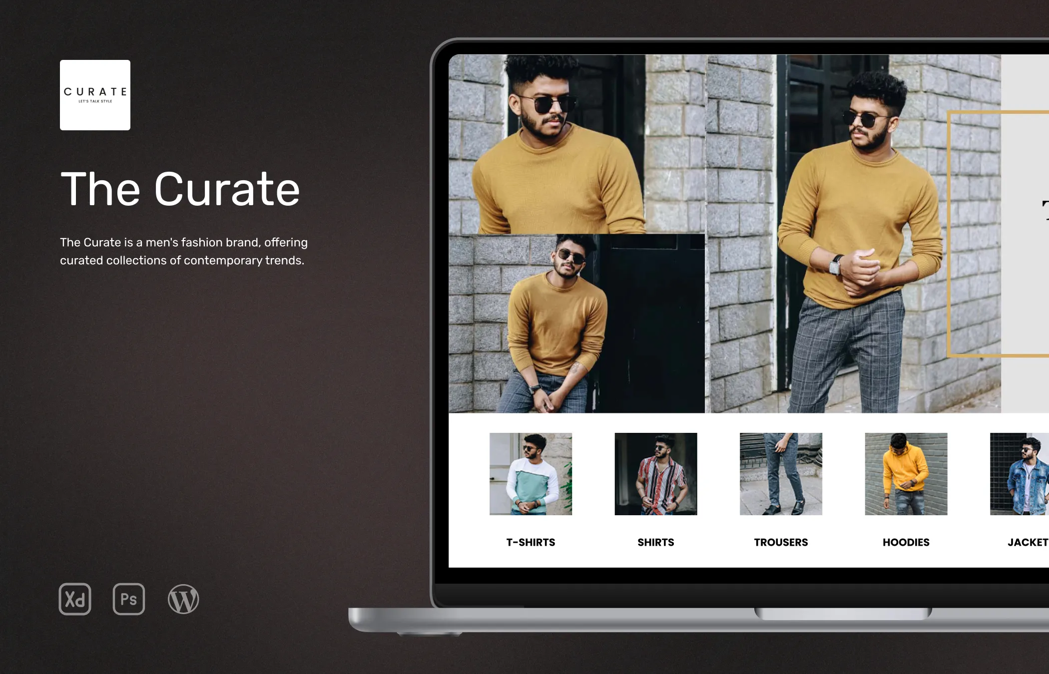
The Curate is a men's fashion store based in Chennai, India. The objective of this project was to create an online shopping experience for men seeking fashionable clothing. The target audience of The Curate comprises Indian men who are looking to stay updated with the latest fashion trends and express their style through their clothing choices.
They wanted to go with a minimalistic design with only black and white colors so that the product images stand out causing no distraction from unnecessary design elements.
The primary goal was to design a user-friendly website that would attract visitors and encourage them to explore the collection of trendy clothing items and accessories available at The Curate.
Role
UI Designer and Developer
Tools



Research
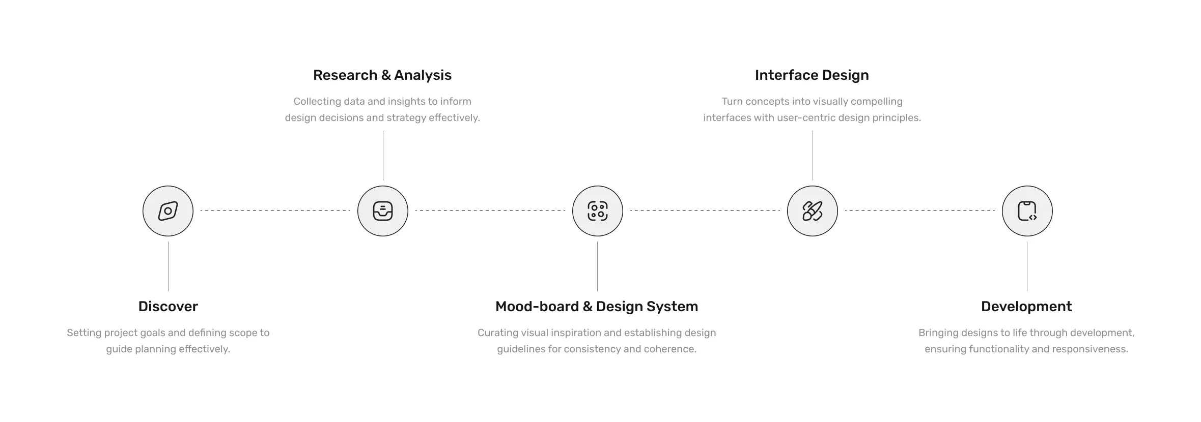
To gather valuable insights for the project, I conducted research using various tools and platforms. To gain a better understanding of the target audience's preferences and behaviors, I used the StatCounter site for data.
By analyzing screen resolution and browser usage data specific to the Indian market over the past two years, I obtained info regarding the most common viewports and devices used by Indian users. This data guided my design decisions and helped me prioritize the website's responsiveness and compatibility with popular screen sizes and browsers.
I used online metrics tools like SimilarWeb to conduct competitor analysis and gain insights into other popular men's clothing online stores in the Indian market. This research not only allowed me to identify successful industry practices but also helped me identify areas of improvement and potential unique selling points for The Curate.
Combining the data from StatCounter and insights from the competitor analysis, I was able to gather the information that shaped my decisions.
Competitor Analysis
During the competitor analysis phase, I studied other popular men's clothing stores’ online presence in the Indian market to gather data and identify opportunities for The Curate. I examined other sites’ overall layout structure, design elements, user experience strategies, and features that resonated well with the site visitors. This analysis helped me understand the competitive landscape.
This information guided the design and development process, allowing me to create a website that satisfied the goals of my client.
Existing Problems
During the evaluation of competitor websites and popular clothing e-commerce platforms, I identified several existing problems that could be improved upon to enhance the user experience. Many websites had complex navigation structures, making it difficult for users to find specific products or navigate to relevant sections. This confusion could result in frustration and potentially lead to a higher bounce rate.
Another common problem was the overwhelming amount of product options without proper organization or filtering capabilities. Users often had to spend significant time scrolling through numerous pages to find the items they were looking for.
Another problem was most sites displayed mockup images for products like Photoshop or Blender rendered mockups that are shiny and can be perceived as fake by visitors. By identifying these existing problems, I recognized the need for a more user-friendly and streamlined experience on the client's website.
Solutions
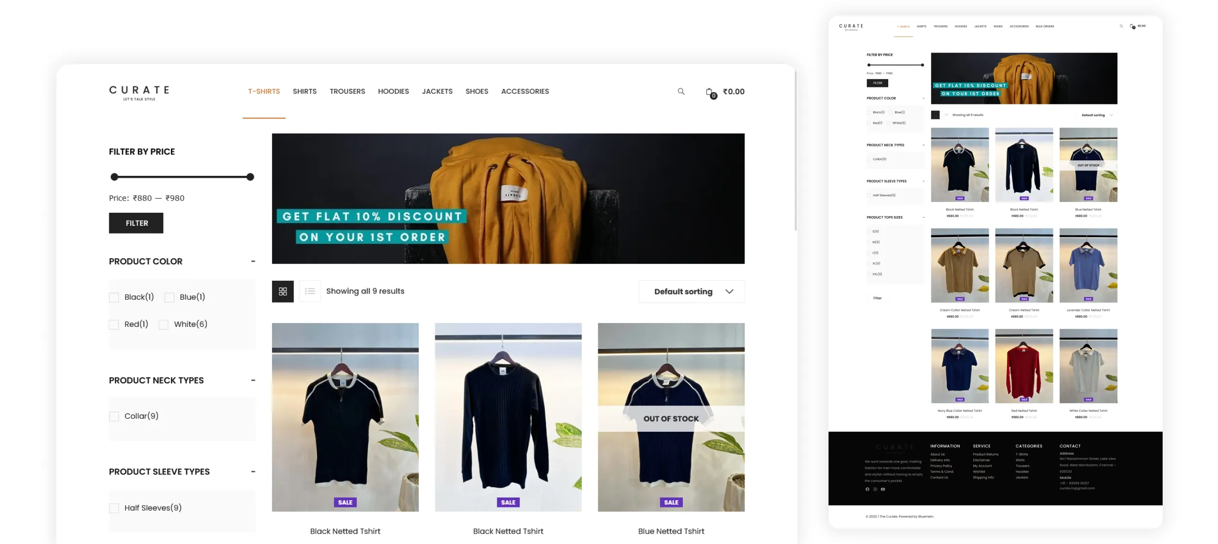
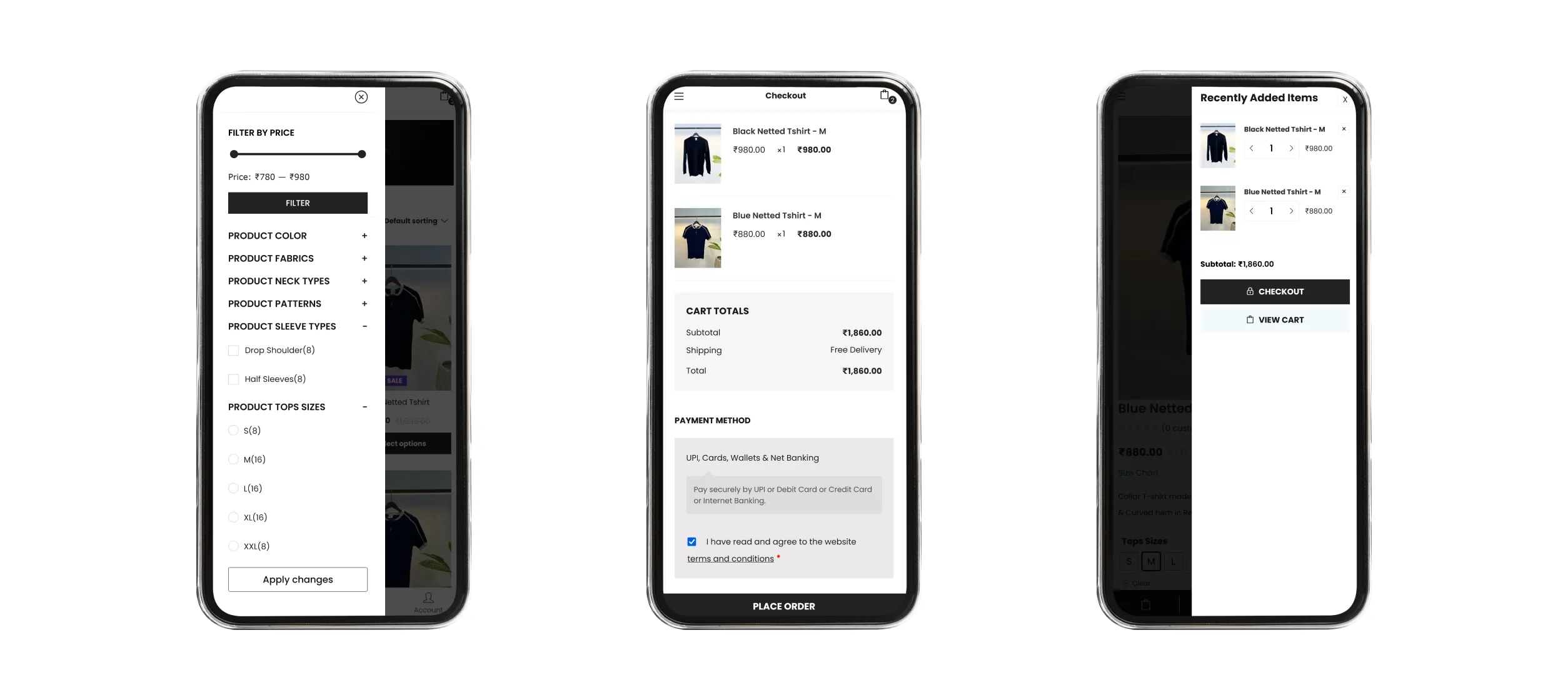
Implement a clean and intuitive navigation structure that allows users to easily find the desired products and navigate through different categories. Enhance the filtering and sorting capabilities to help users refine their search based on specific criteria such as size, color, price range, and style. This will enable users to quickly narrow down their choices and find the products that meet their preferences.
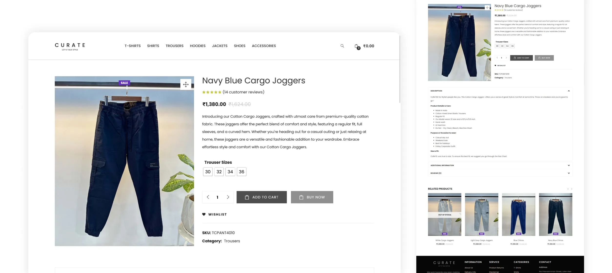
Present products by having high-quality images that showcase the clothing items from various angles with a person wearing it in most cases. Additionally, provide comprehensive and accurate product descriptions, including information on material, sizing, care instructions, and any unique features.
Make the checkout process by minimizing the number of steps required to complete a purchase. Implement a guest checkout option to allow users to make a quick purchase without the need for creating an account. By implementing these solutions, I hope the site will be more user-friendly and easier for visitors to make purchases.
Project Goals
I and the client agreed upon the following goals,
- The primary request was to be minimal using just black and white instead of too many colors and fancy design elements which can be distracting the visitors. The goal was to focus on displaying the product images for users to make quick decisions.
- Implement easy navigation, advanced filtering options, and improved product presentation, to make it easier for users to browse, discover, and purchase.
- The Curate aims to establish itself as a reputable and trusted men's fashion brand. So the consistency in the usage of fonts, colors, and minimalistic design is carried throughout the website and even on their physical store interiors.
- Have a simple checkout flow and guest checkout for quick product purchasing.
Working Process
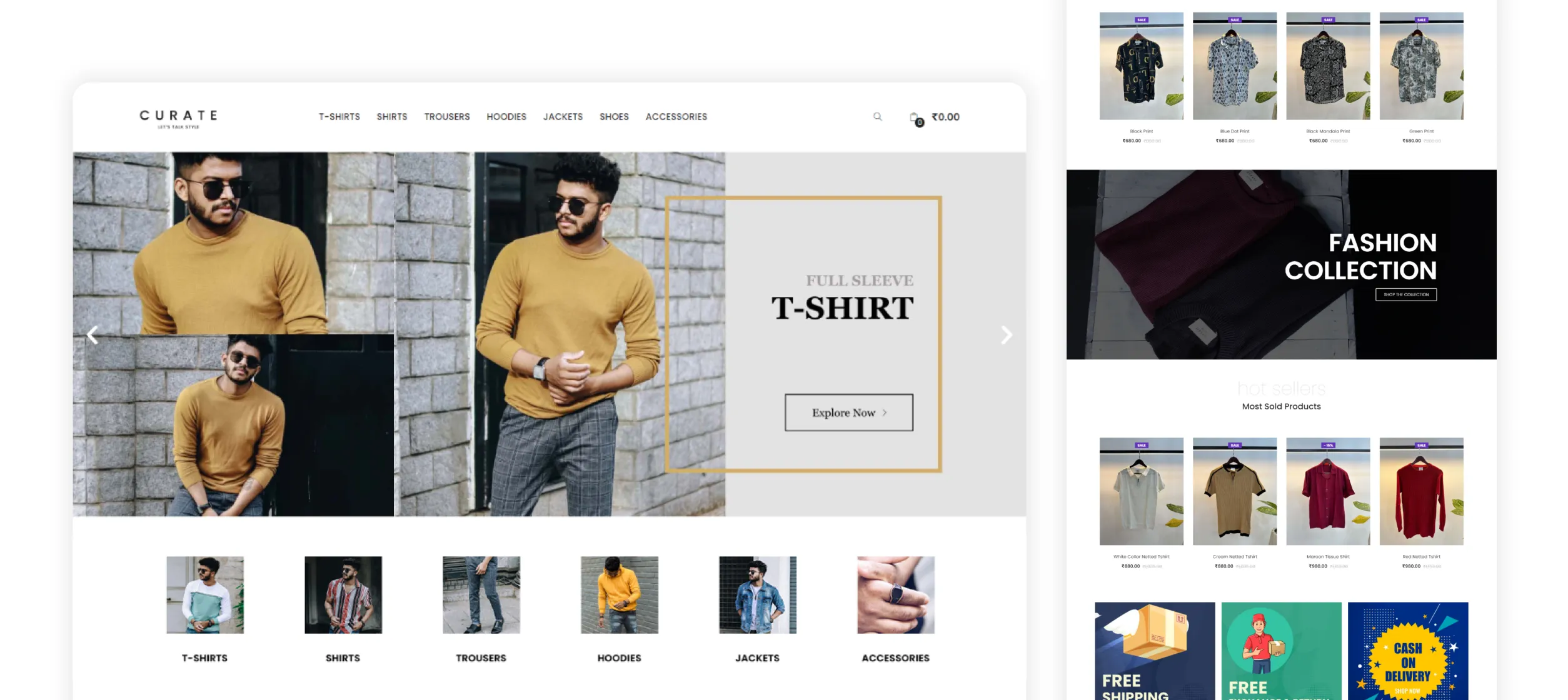
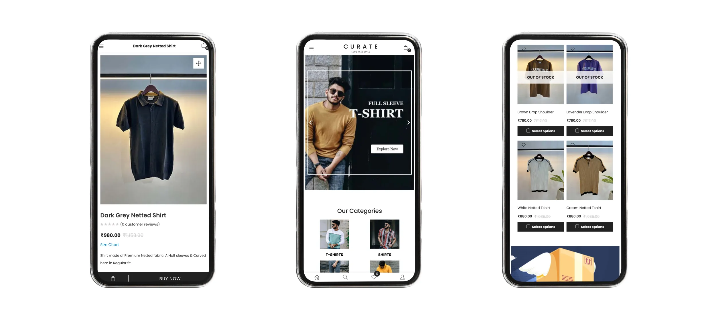
Then I moved to design mockups for key pages such as the homepage, single product display, etc since archives can be customized from the woocommerce options panel. I used Adobe XD for creating layouts Photoshop for banners and editing images.
Sitemap
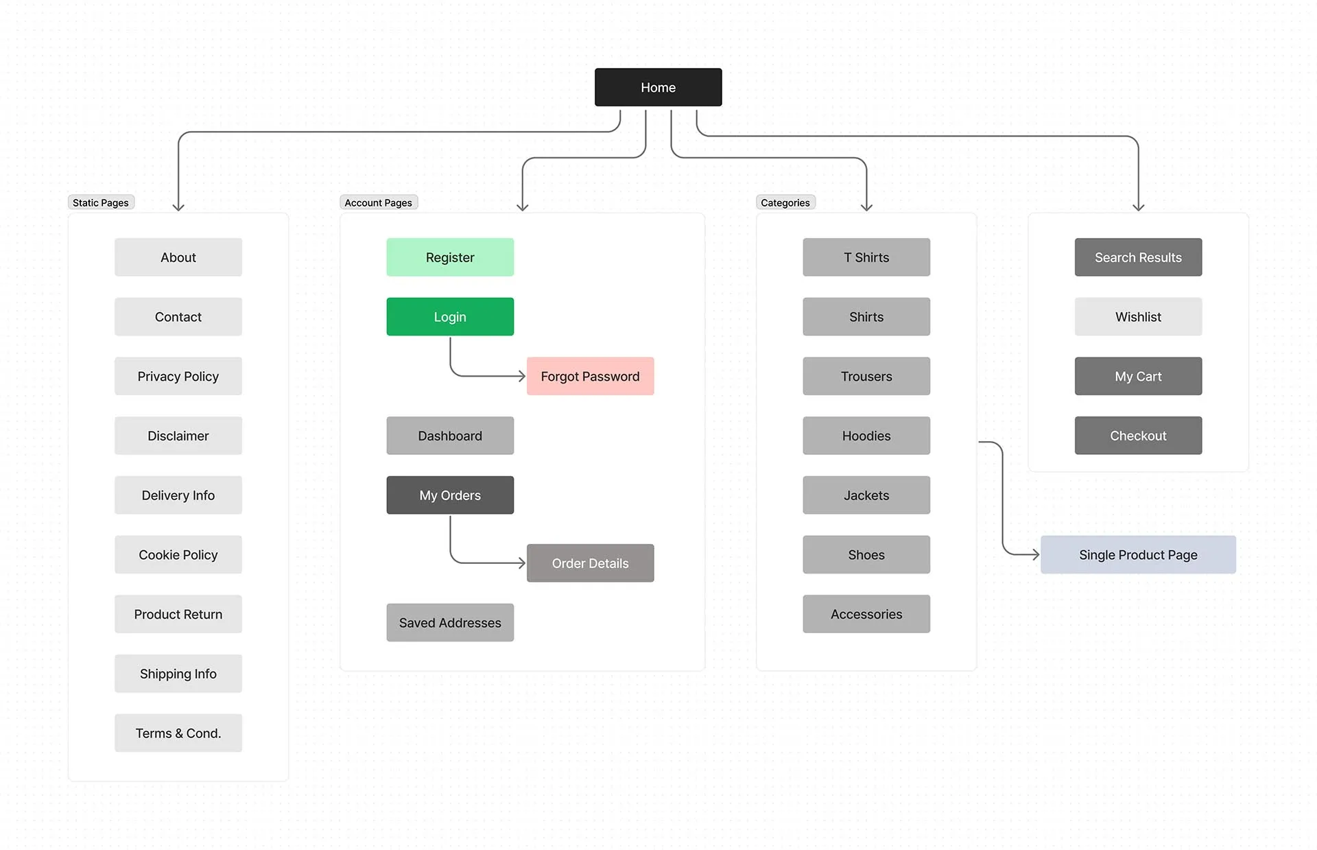
Representation of this website's structure and organization, outlining the hierarchy and navigation flow of pages and content.
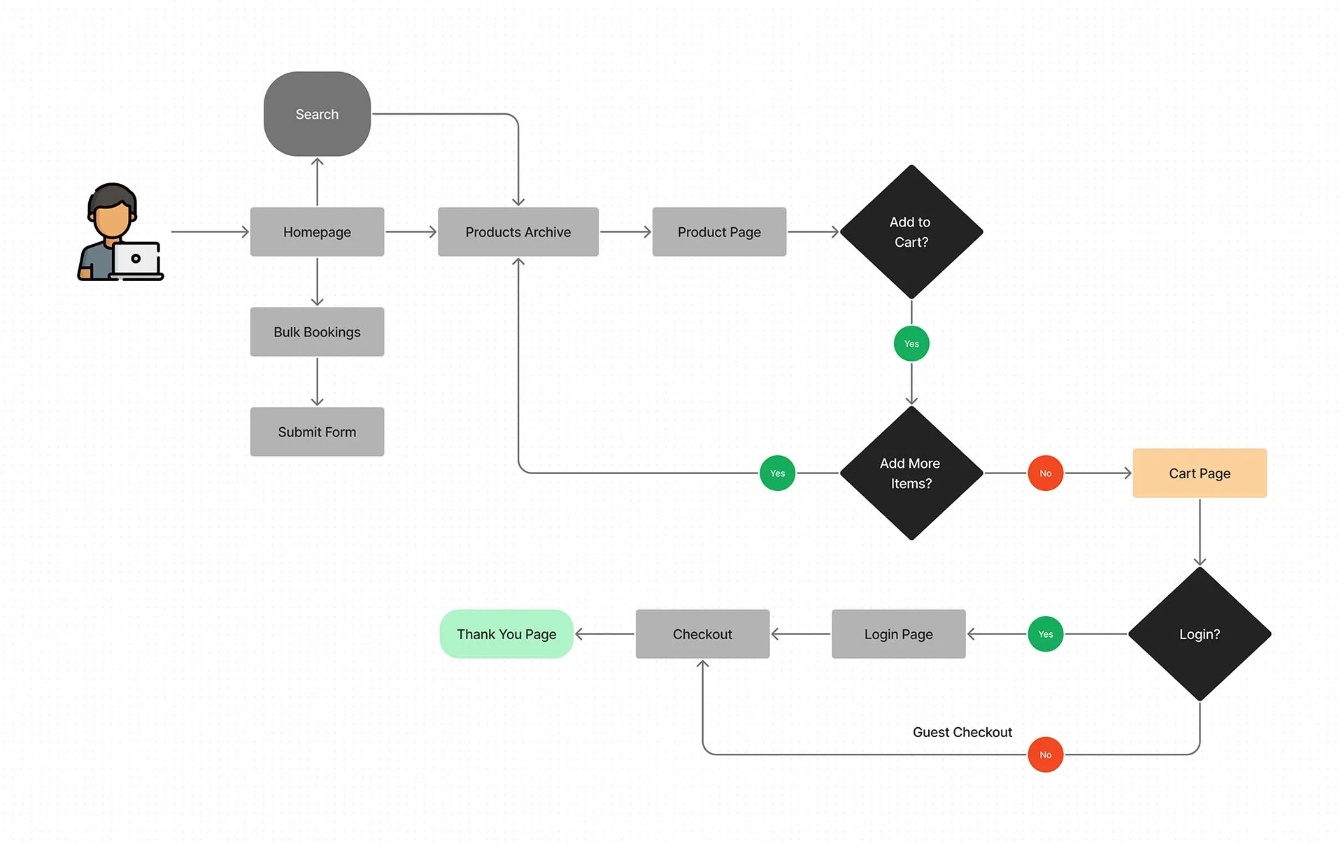
User Flow
Here is a representation of the user's journey and interactions to accomplish tasks on this website.
Website Screenshots
Development
I developed this website using WordPress with woocommerce. Most of the layouts are built using the Elementor tool. And it did need some custom CSS for making it responsive and slight tweaks to make it look good. Finally added tracking scripts and set up the hosting at Digital Ocean to make it live.
Go to Visuals
