Sensualkart
Adult Toys & Wellness
Project Overview
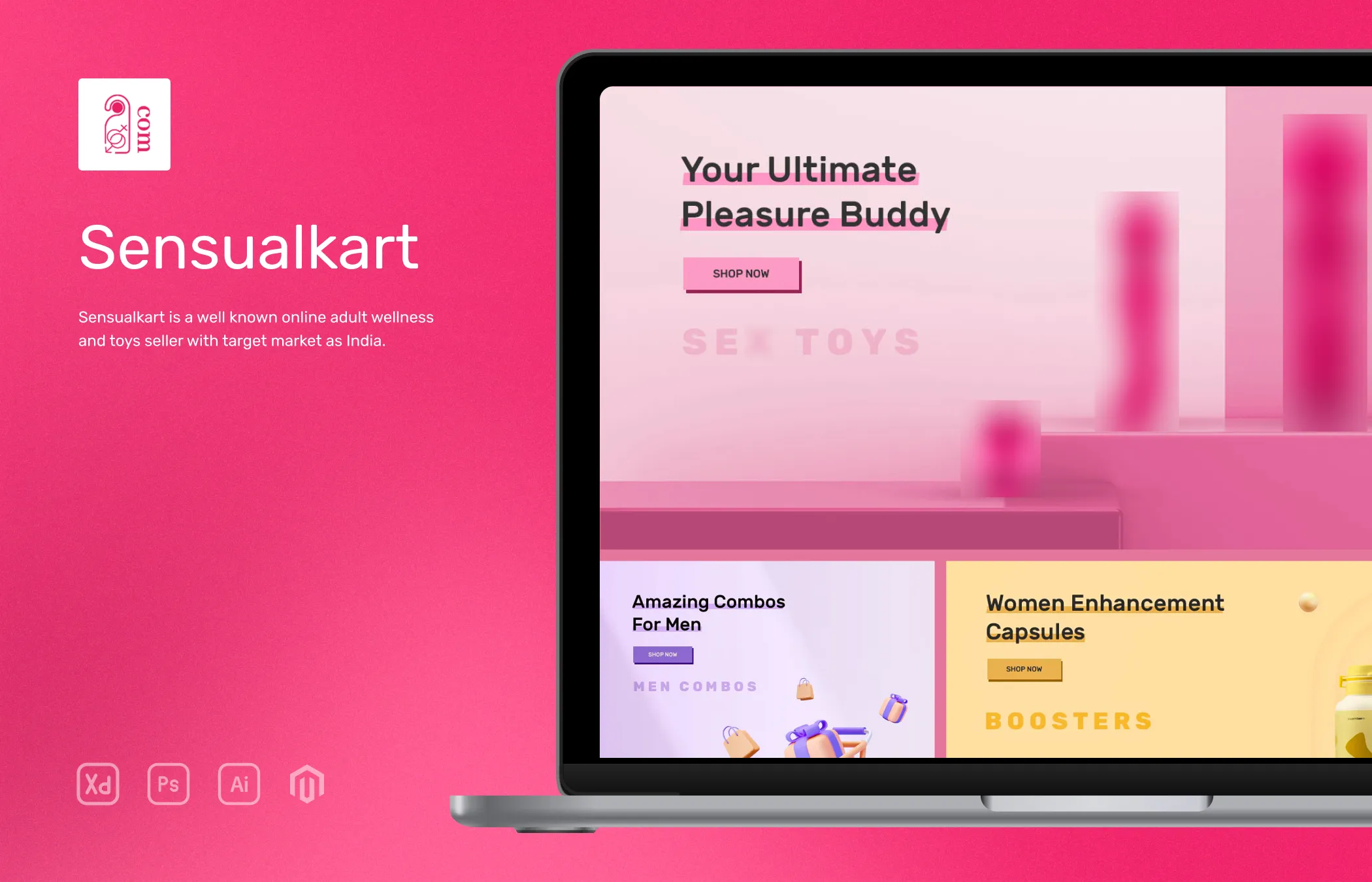
SensualKart is an eCommerce website from Shanga (the parent company). It is an online store for selling s*x toys and adult wellness products like enhancement pills, creams and cond**s etc. This is a redesign project where the old site was too old and Shanga wanted a complete rebuild of the site while retaining the old data.
It is a bit of a difficult process since the old site was on Magento 1.9.x and I was trying to redevelop it in Magento 2.3.x. Migrating old user data, products and order data was really challenging and since I was using Magento for the first time it was a steep learning curve compared to WordPress or Shopify.
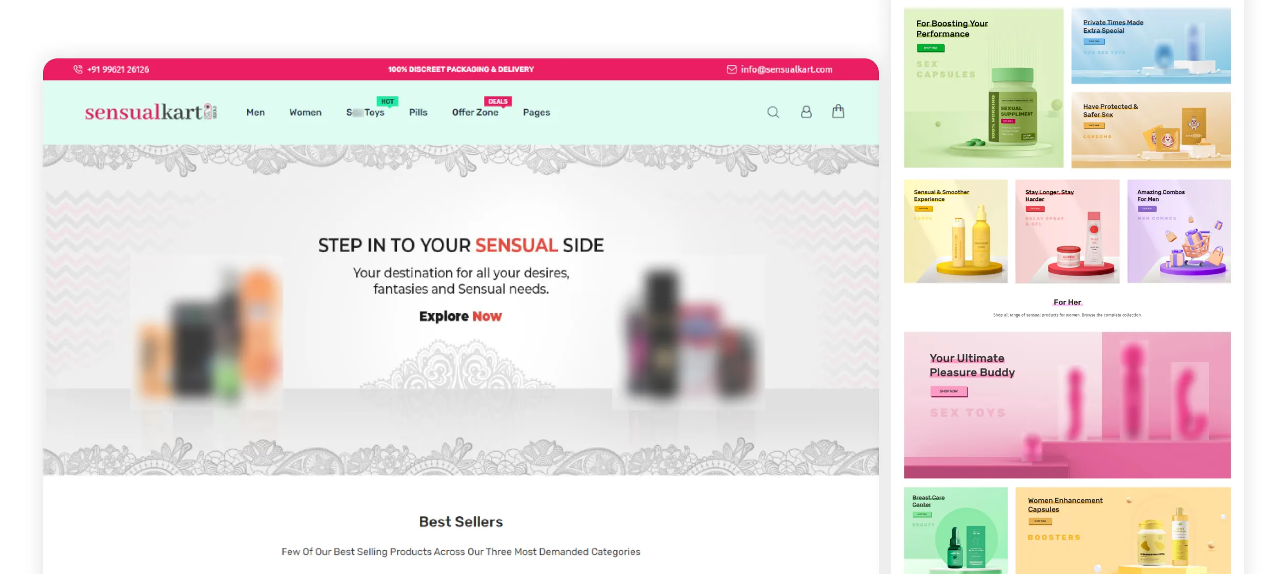
The old site was majorly focused on pills and gels but with the new site the primary focus was on selling toys and pulling people who prefer those products. The overall goal was to make the site colorful, attractive, intuitive interface and easier navigation to access the different categories and products.
Role
UI Designer and Developer
Tools





Research
For research I tried to understand the target market and the specific needs of customers seeking adult products. I researched online using metric/ analysis tools to gain insights into the adult wellness industry in India, including market size, trends, and consumer preferences.
Next, I studied user behavior and preferences to understand how individuals search for and interact with adult wellness products online on popular competitor websites. Also had to read legal stuff to confirm what can and can’t be shown and general rules surrounding that industry in India.
Given the importance of privacy for Sensualkart’s customers, in-depth research was conducted on best practices for maintaining customer confidentiality, data security and discreet packaging options.
The research phase provided valuable insights into the market landscape, user preferences, legal considerations, and privacy requirements. This data was instrumental in shaping the website's design and features.
Competitor Analysis
I researched several adult wellness websites and marketplaces catering to the Indian market. The objective was to gain insights into their strategies, offerings, and user experience in order to identify areas for improvement and potential competitive advantages.
Most competitor websites offered a wide range of adult wellness products, including s*x toys, lubricants, contraceptives, and other related items. Understanding the category and products was important because I had no idea about this industry except for the basic knowledge that most people have. This helped me to arrange and properly present the categories and subcategories for easier navigation.
I thoroughly analyzed the user experience and UI of competitor websites. This included evaluating website navigation, search functionality, product categorization, product presentation, product information and checkout processes. Analyzing strengths and weaknesses of competitor interfaces assisted in designing an intuitive and user-friendly experience for SensualKart customers.
I also read about the privacy and packaging of competitors by reading the product reviews, Google reviews etc for identifying opportunities to enhance privacy and packaging features for my client’s customers.
With these insights, I really hope I can make SensualKart position itself as a leading and trusted platform for adult wellness products in the Indian market (which did happen, the customers and visitors count grew big and also I made some keywords rank number 1 on Google for sometime back when I did SEO for them).
Existing Problems
After assessing existing adult wellness websites in the Indian market, a few areas for improvement and potential challenges were identified. These existing problems serve as opportunities for SensualKart to address and differentiate itself.
Many competitor websites lacked clear product information like descriptions, specifications, and usage instructions. This could potentially result in customers feeling uncertain about buying a product. Discretion and privacy are crucial considerations in the adult wellness industry. Some competitors were found to have inadequate or inconsistent discreet packaging options which can raise concerns given that the customers are from India where buying these products are not normalized in all states or cities.
Another issue was none of them had any clear navigation to products, yes there were categories but in this industry there are a wide range of products for different purposes thus many products remain hidden since they are buried deep inside.
Solutions
For privacy, my client wanted to prioritize discreet packaging, ensuring that all orders are packaged discreetly to maintain customer privacy so customers can feel safe and confident while purchasing.
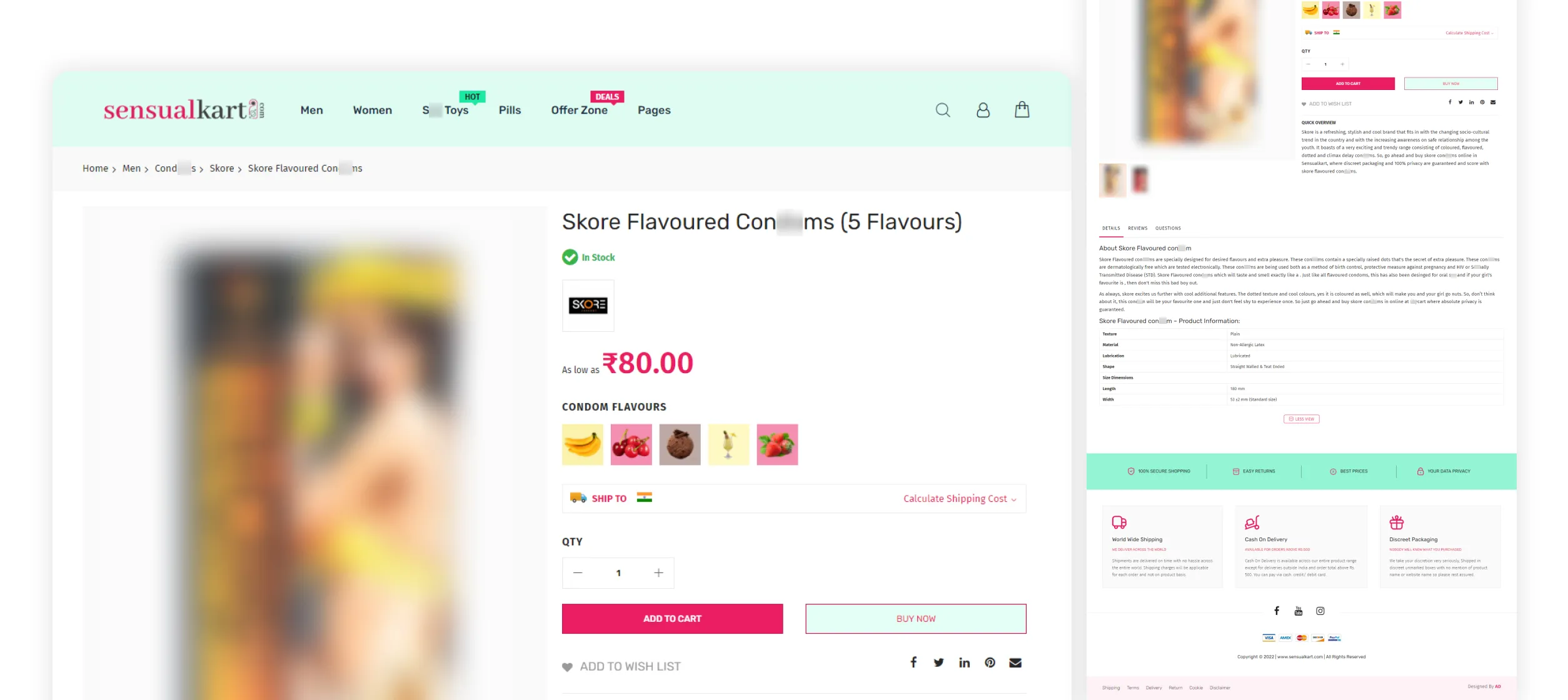
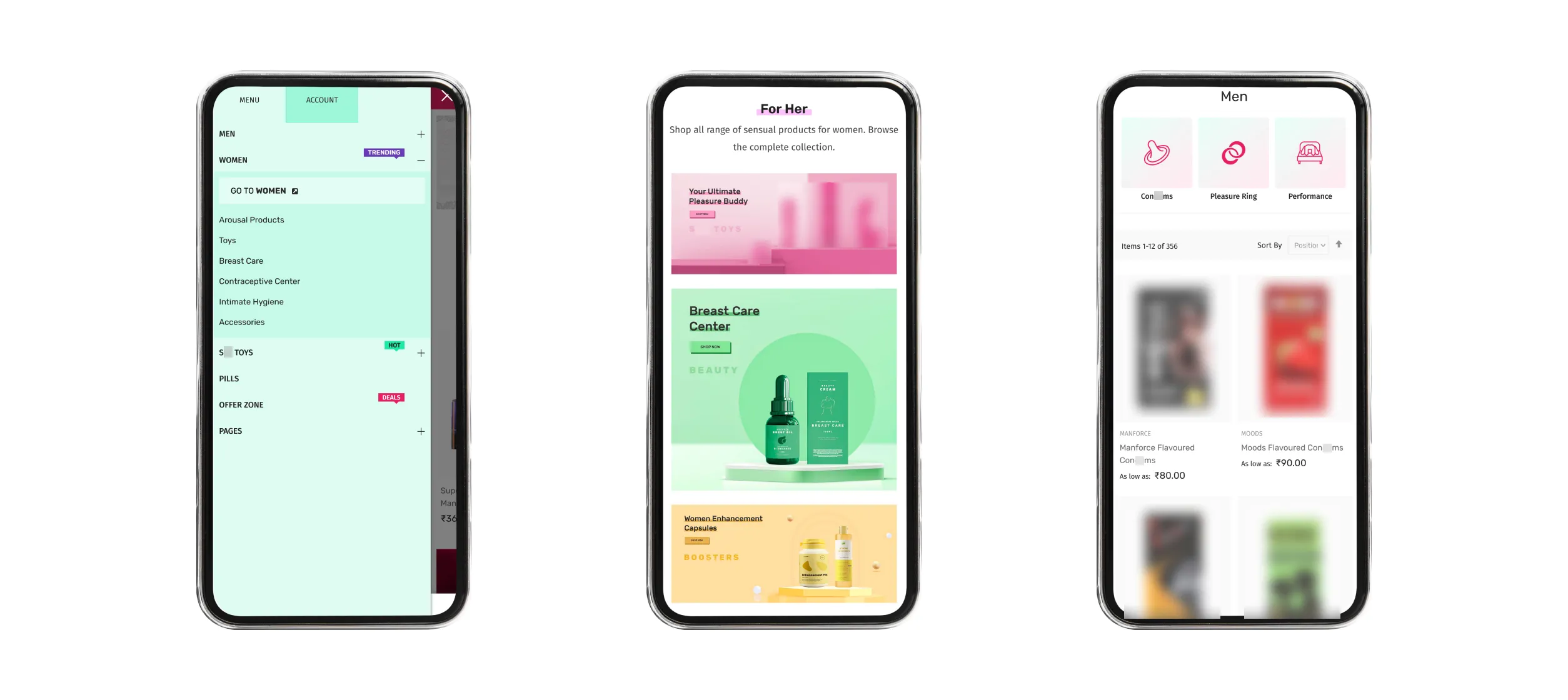
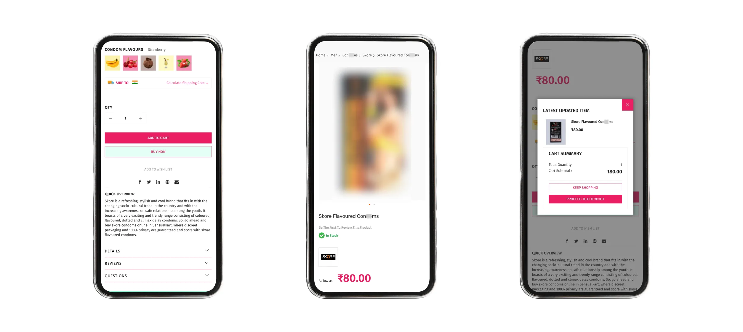
For easier navigation, I decided to have mini I thumbnails like banners for subcategories inside the categories page to help users move around easily and have context of what they are doing. For enhancing the product page we decided to have clear product descriptions and usage instructions. Some products have many variations inside them, so I thought of using images for some swatches thus helping customers find preferred products quickly.
Also to boost the sales of most popular products in each category, I wanted to display them at the top in category pages to help reach product pages quickly (similar to sponsored products seen on Amazon).
Project Goals
I and my client agreed on the following goals,
- Easier navigation to all areas of the website (categories).
- Colorful design that attracts website visitors.
- Easy and Intuitive way for selecting product variations.
- Homepage banners to easily navigate to different categories.
- Simple checkout page for quicker sale conversion.
- Subcategory mini banners inside category page for quick product discovery.
- Featured/ Popular products on top of categories (like sponsored products seen on Amazon).
- Ensure the site's load speed is faster and responsive on mobile devices.
- Have an option for guest checkout for people who do not prefer to sign up.
Working Process
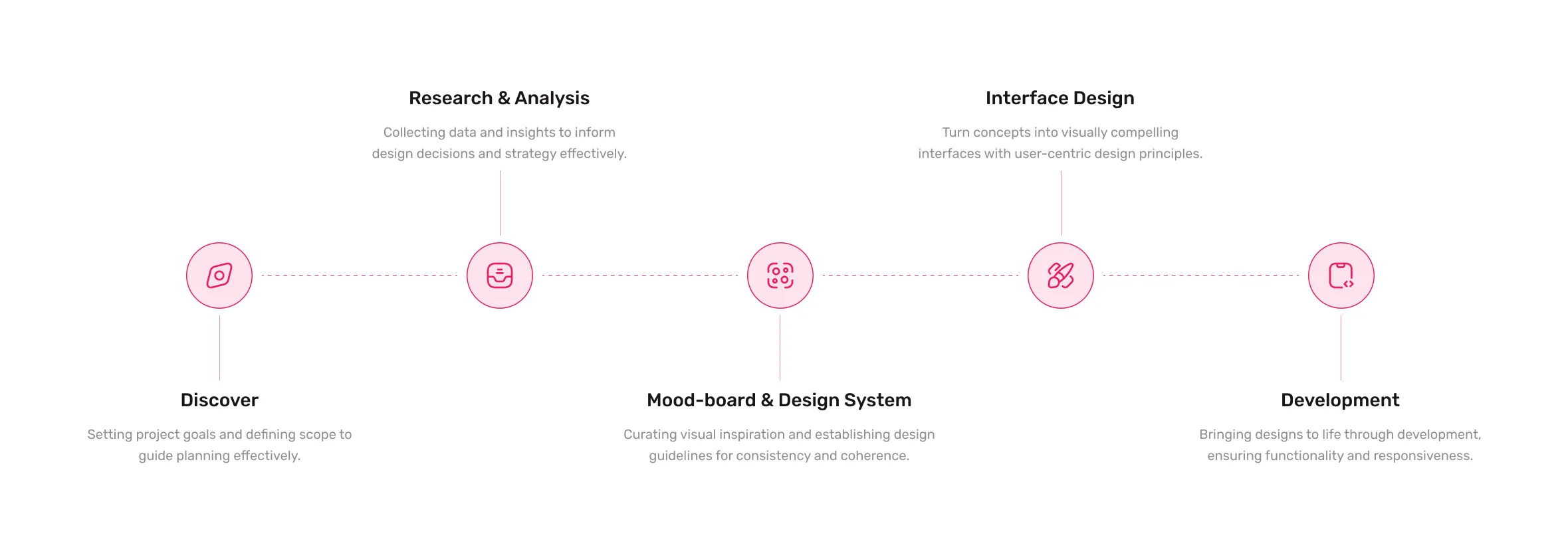
Since this website was powered by the Magento platform, most of the internal pages are built-in but I had the ability to design from panels (not all pages or sections but majority of them). So I decided how to present each page and I started designing the UI for Homepage, category archive, header, footer etc using Adobe XD. I used Photoshop for banner edit and resizing.
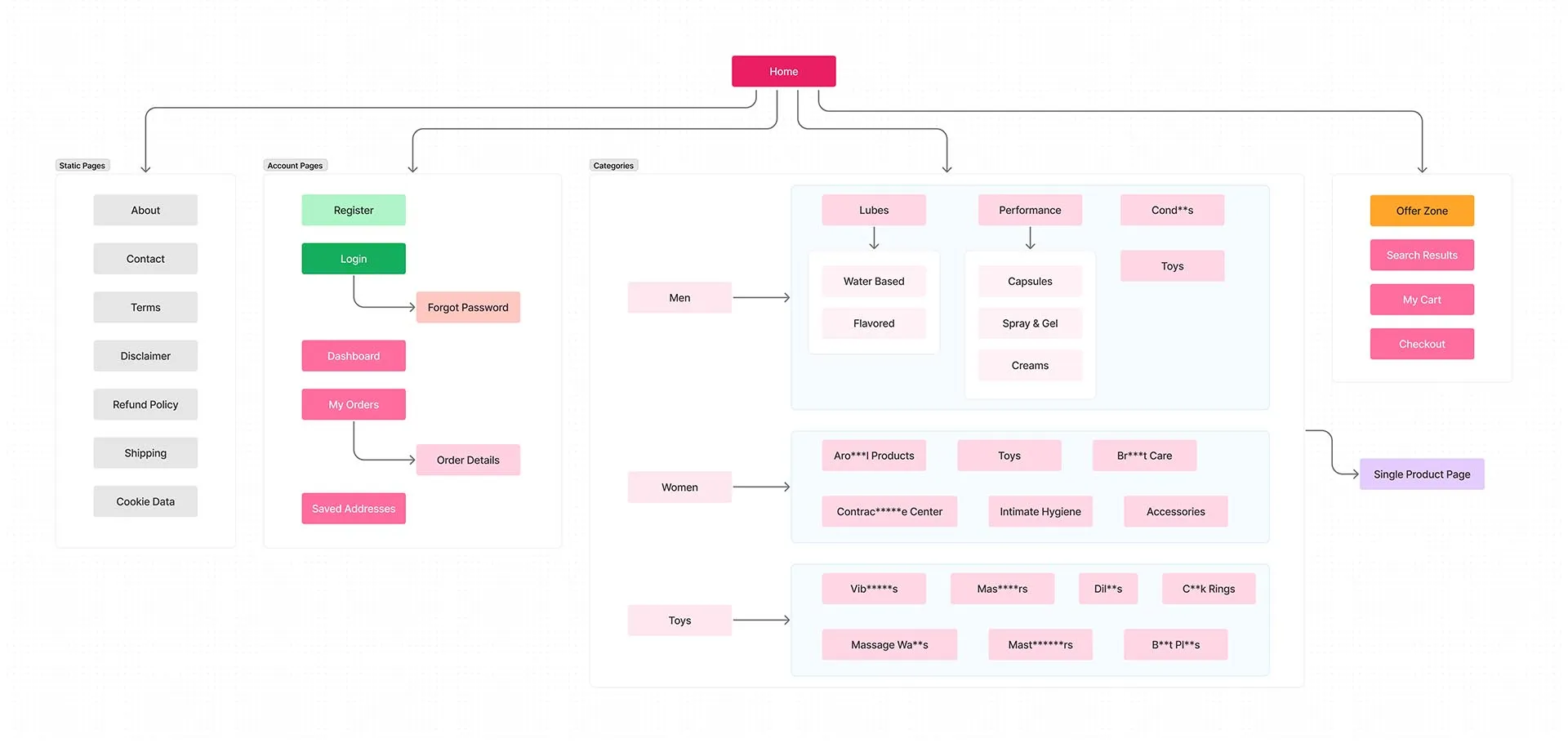
Sitemap
Representation of this website's structure and organization, outlining the hierarchy and navigation flow of pages and content.
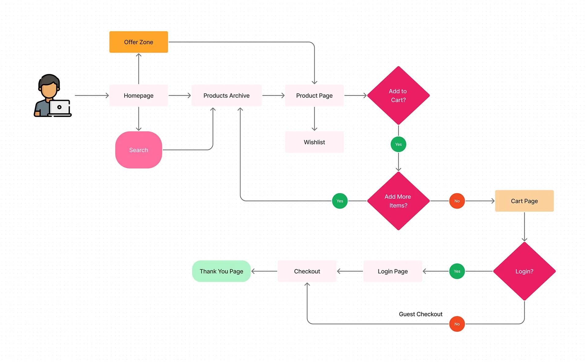
User Flow
Here is a representation of the user's journey and interactions to accomplish tasks on this website.
Website Screenshots
Development
Once the UI was confirmed, I started setting up the server and installing Magento using composer. Then installed and activated themes and necessary plugins. After setting up the store inside Magento and other settings, I started coding the homepage since the design was not able to be achieved from its inbuilt builder. Then moved to setting up menus, navigation structure, etc.
Finally migrated data from the old website to the new website and configured the DNS to point to the new server and took the initial snapshot after making it go live.
Go to Visuals

