Niche Design Loft
Interior Design Company
Project Overview
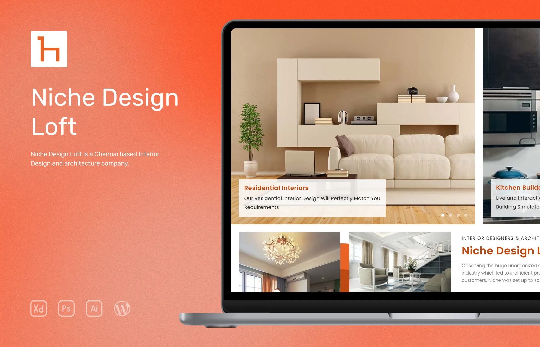
I had the opportunity to collaborate with Niche Design Loft, an interior design company based in Chennai, India. The task at hand was to revamp their existing website, aligning it with contemporary standards and adding any new functionalities if possible to make them stand out. Niche’s target audience was the Indian market for people who are looking for interior design services.
They have many design services among which kitchen interior design service is the most popular one, so they wanted to capitalize on that area. The primary objective was to create an elegant and modern website that would resonate with the target audience, considering the company is targeting the upper-class and upper-middle-class segments of the Indian market.
In addition to that they are highly focused on SEO for the site so they wanted me to come up with ideas to add more pages and therefore an opportunity for more content that can be optimized for their targeting keywords.
Role
UI Designer and Developer
Tools






Research
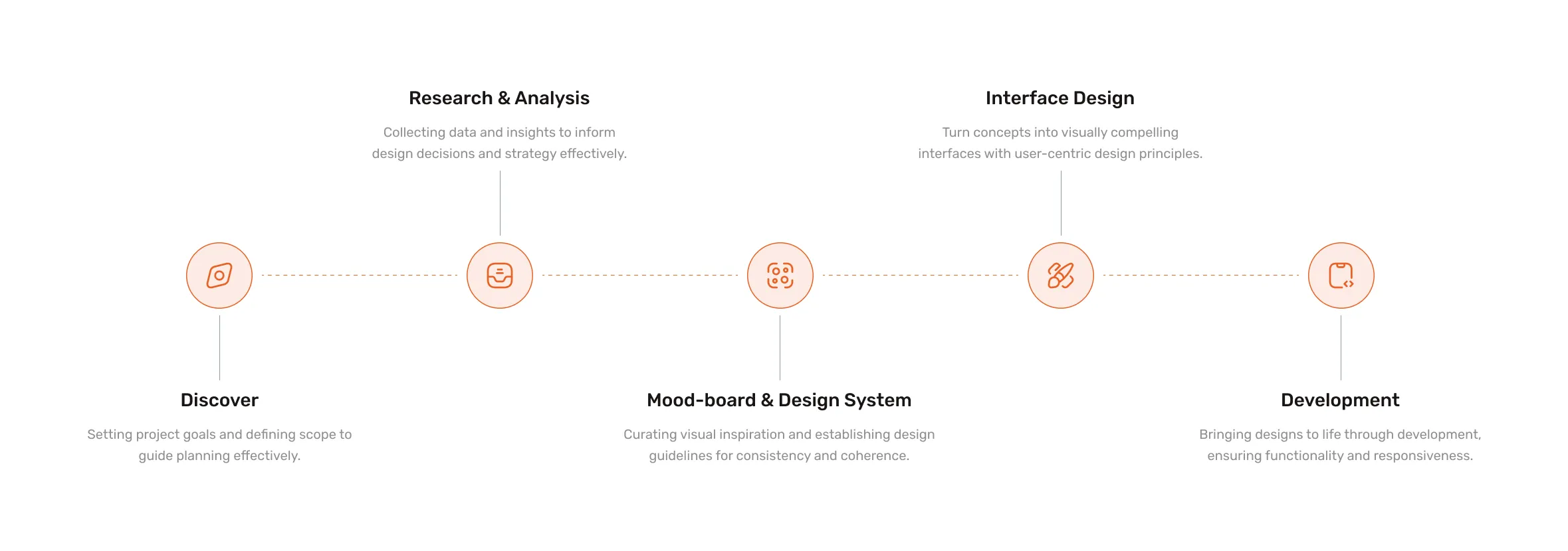
In the research phase, I began by conducting an analysis of the interior design industry in India. This involved studying the preferences, trends, and demands of Indian homeowners when it came to interior design services. By gaining insights into the market landscape, I could identify opportunities and challenges.
I explored the online presence and strategies of competitors in the Indian interior design industry. By examining their websites, content, and user experiences using tools like ahref, similarweb, and other analyzing tools. I gained insights on how to structure the categories and design approaches.
Additionally, I studied SEO best practices to develop an understanding of how to optimize the website for search engines. This involved conducting keyword research to identify relevant and high-ranking keywords specific to interior design services in the chosen market (Initially for Chennai and Bangalore cities).
Overall, the research phase allowed me to gather valuable data about the target market, competitors, and SEO strategies.
Competitor Analysis
I examined the websites and online presence of key competitors in the Indian interior design industry. This exercise aimed to identify their strengths, weaknesses, and strategies, providing valuable insights so that I can come up with ideas to make Niche Design Loft stand out.
I analyzed the design layouts, aesthetics, and user experiences of competitor websites. This allowed me to pick up design trends, patterns, CTA sections, and elements that resonated well with the target audience. By understanding what worked effectively for competitors, I could propose design solutions that would help attract users and create a good experience on the Niche Design Loft website.
I studied competitors' SEO strategies by examining their keyword usage and on-page optimization. This helped me to identify potential keyword targets and content optimization opportunities for Niche Design Loft's website, ensuring improved visibility in search engine rankings.
This allowed me to get an idea of which page(s) of the site needs more content so that I can focus on making the content more appealing with graphic elements and banners etc.
Existing Problems
Upon conducting competitor analysis, and going through the old website’s Google Analytics data. I was able to identify areas that required improvement to enhance the overall user experience and align with the company's objectives.
Most websites just offer one paragraph of content with some stock image and an inquiry form section on each service page and nothing else. Also, most sites don’t have clear navigation to all sections of the site making it challenging to reach a particular service page.
Then comes the frustrating popup form asking users to fill up before even they go through the page fully.
Solutions
I aimed to implement a fresh and visually appealing design that aligns with the target audience's preferences. Utilize overall aesthetics, sleek layouts, and premium visual elements to create a sophisticated and engaging user interface. Revise the website's navigation structure to ensure intuitive and easy access to all service pages.
Implement clear and concise menu options, dropdowns, or a dedicated service section, enabling visitors to navigate effortlessly and explore the full range of interior design services offered by Niche Design Loft.
I ensured that the use of the company's logo, color palette, typography, and other visual elements are the same across the entire site and did not change from page to page. I hoped that this will create a cohesive and memorable user experience, reinforcing the brand's image.
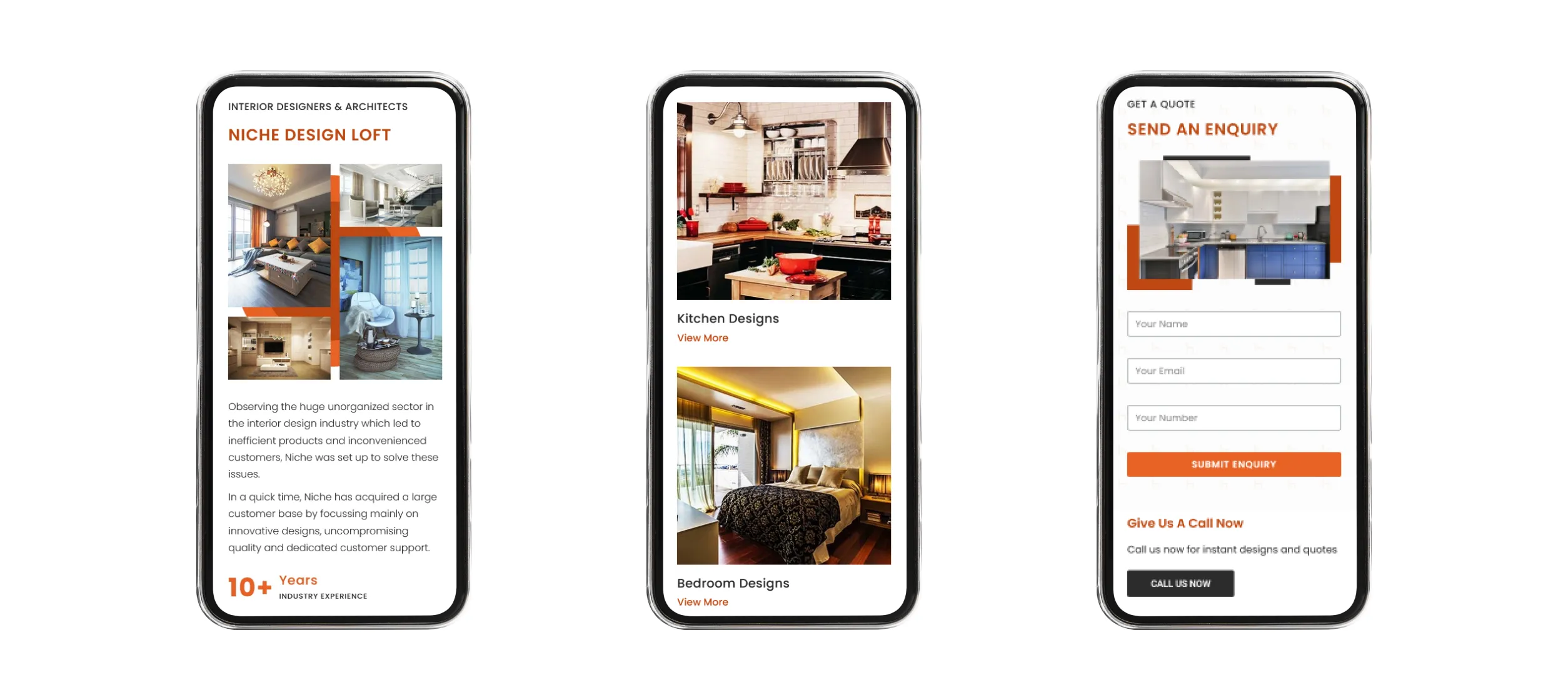
I wanted to implement a simple yet appealing way to present the CTA section with an option to directly call from the website instead of copying and pasting the number back to the phone app and also the traditional form submission is also present so that users can choose whichever they prefer.
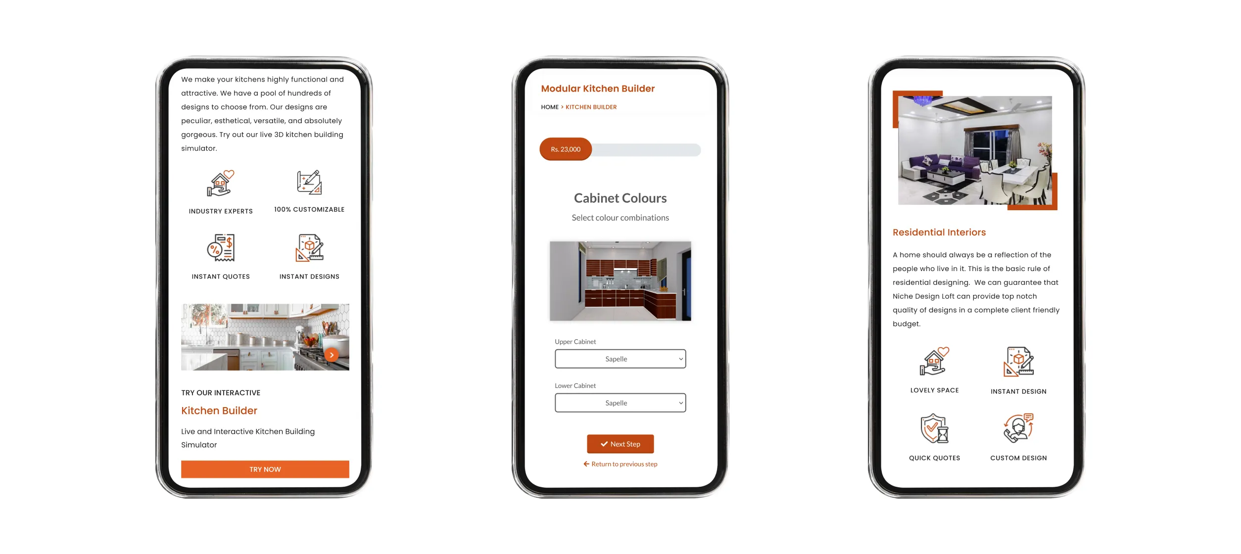
Since they are more focused on kitchen interiors, we came up with a feature to allow users to build their kitchen by choosing a set of options and giving the expected price as they choose, and get an instant quote instead of submitting the form and waiting for the team to get back where the chances are high if Niche’s sales team delay to contact some competitor might convert them as a client.
Project Goals
Based on the observed data and discussions with my client, we established the following goals
- Improve the overall user experience by creating an intuitive and visually appealing website design.
- Make it easy for visitors to navigate through the site, explore different services, and view the portfolio effortlessly.
- Implementing persuasive design elements and simple CTA sections to drive more conversions.
- Highlight Niche Design Loft's specialization in kitchen interior design services. The goal is to create a dedicated section that showcases modular kitchen interior service with a CTA for kitchen building mini app.
- Implementing effective SEO strategies, the website aims to increase organic traffic, attract a wider audience, and enhance its online presence in the Indian market for interior design services.
- Create a live cost-estimating kitchen building app inside the website.
Working Process
After finalizing the goals, I moved to design mockups for all the pages such as the homepage, service page, single sub-service pages, etc. I used Adobe XD for creating layouts and designing custom icons. I used Photoshop for banners and editing/ resizing gallery images.
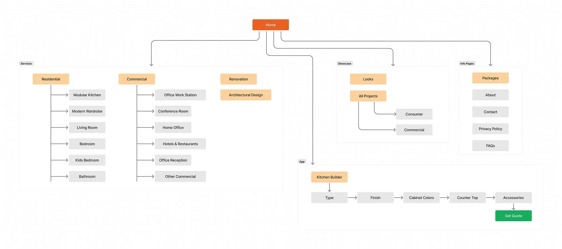
Sitemap
Representation of this website's structure and organization, outlining the hierarchy and navigation flow of pages and content.
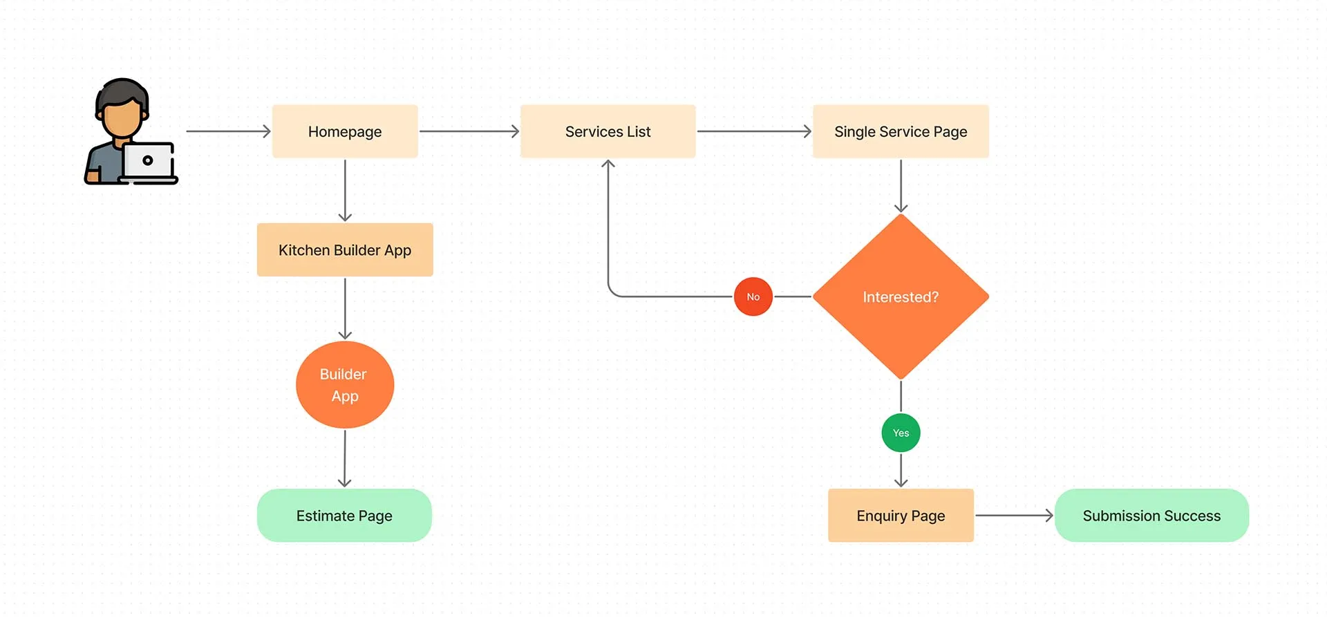
User Flow
Here is a representation of the user's journey and interactions to accomplish tasks on this website.
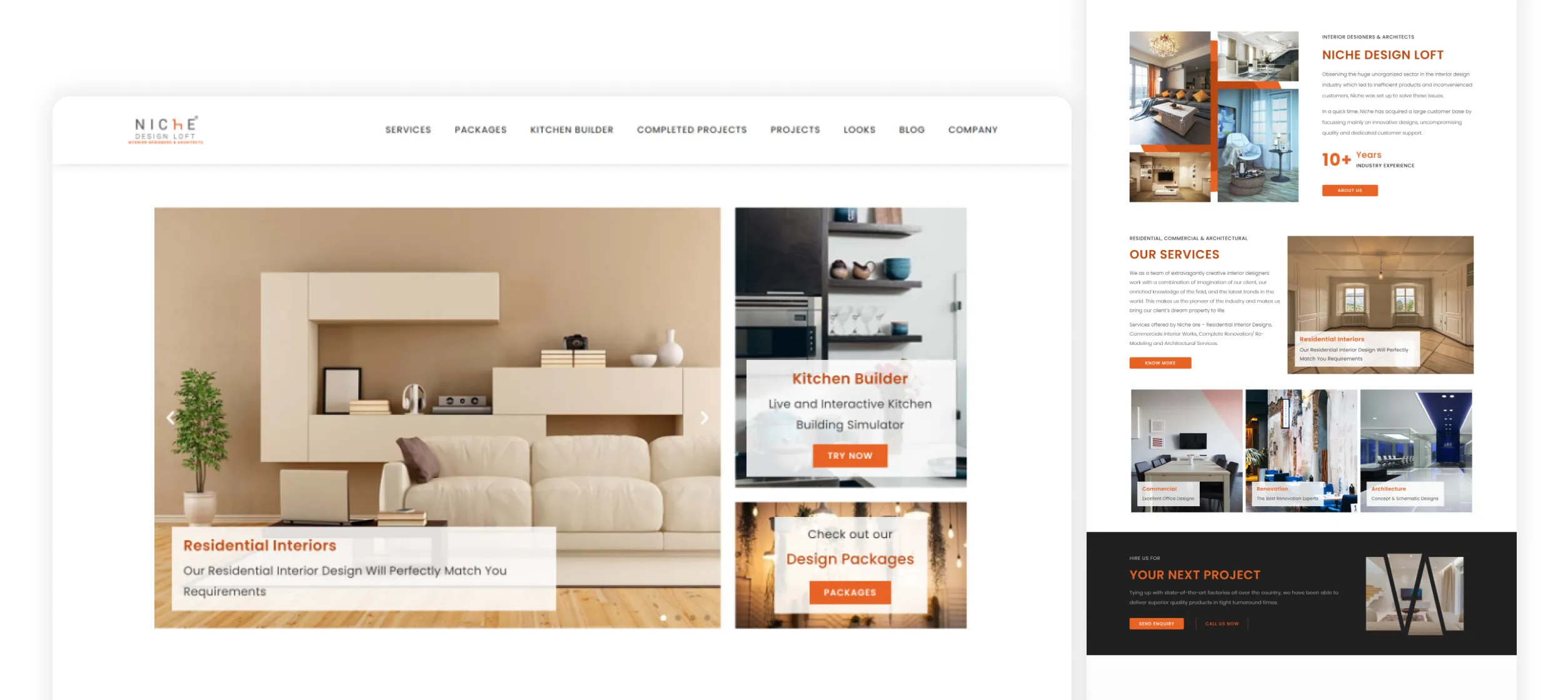
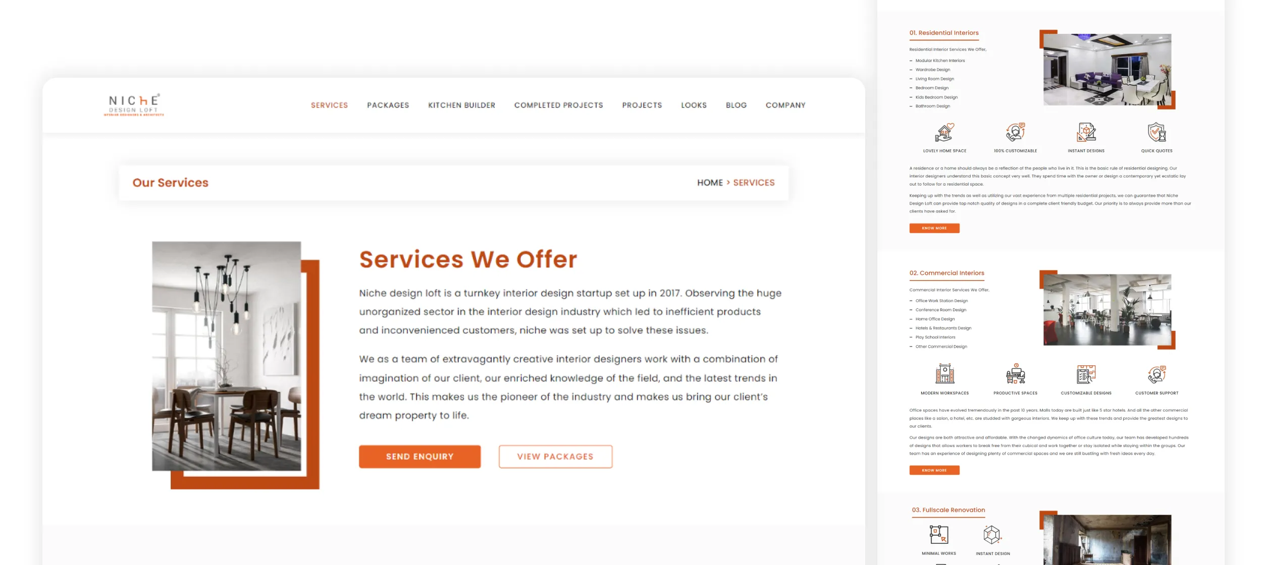
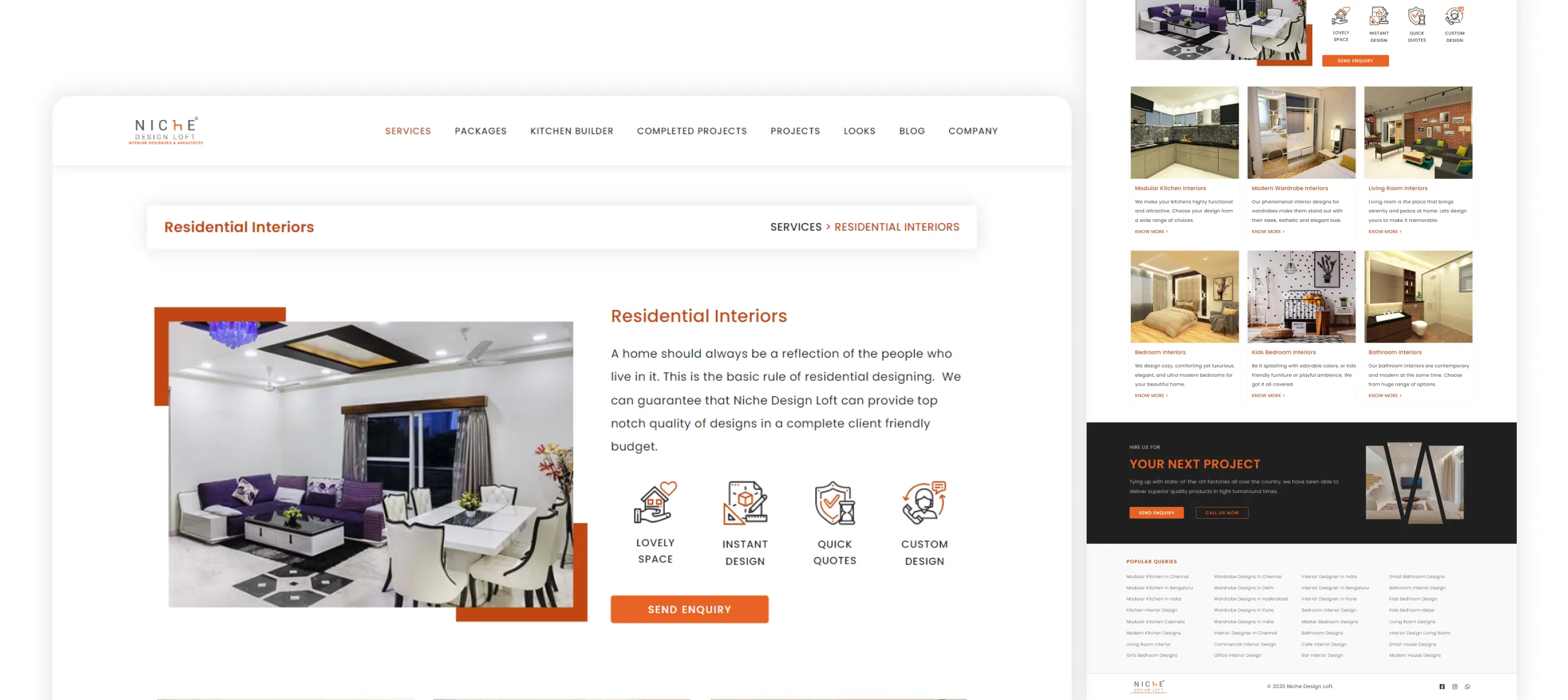
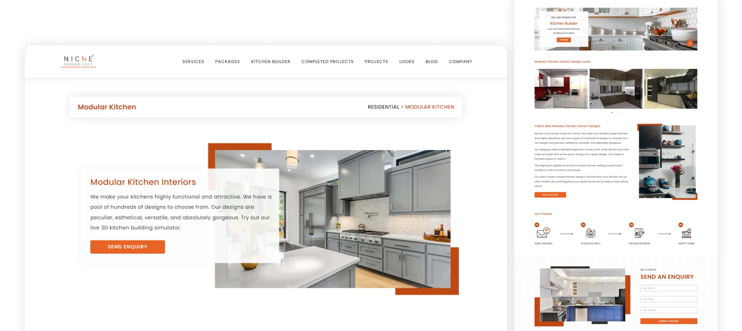
Website Screenshots
Development
After getting confirmation on the presented design I moved to developing the website in WordPress. I installed a boilerplate theme and designed each page using Elementor Builder. For some sections, I had to write some custom CSS for absolute positioning elements and fix some responsive things which Elementor lacked at that time of development.
Finally, added Google Tag Manager to integrate Google Analytics and hosted on a cPanel based host provider.
Go to Visuals
