Online Face Creams
Beauty Pharmacy (Dermatology Products)
Project Overview
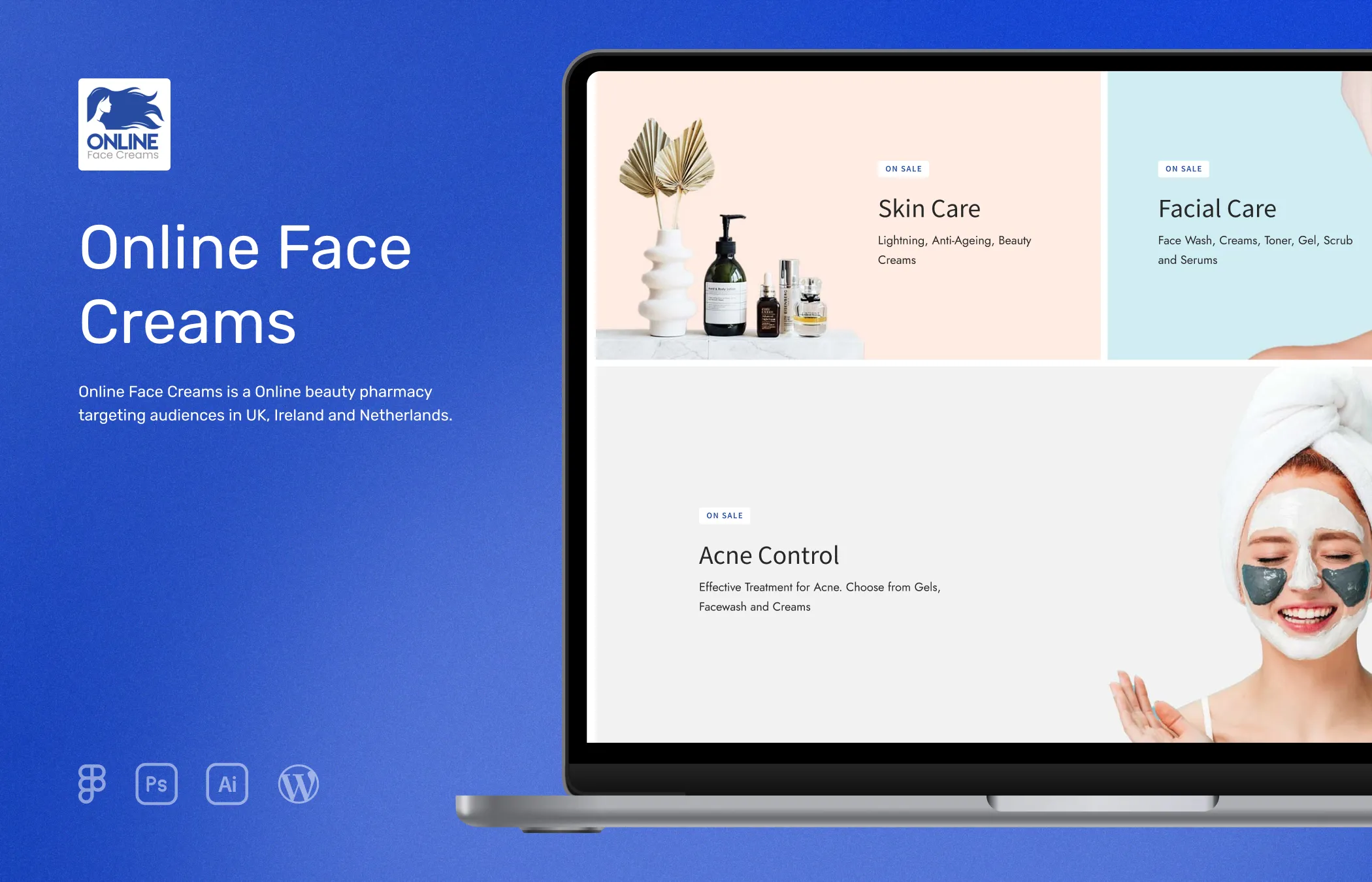
Online Face Creams (OFC) is a beauty pharmacy website designed to provide an easy online shopping experience for customers. My role in this project was to enhance the website's usability and create a simple and easy-to-use interface that would make it effortless for site visitors to navigate and find their desired products.
With a focus on simplicity and clarity, the goal was to present the products in a clean and straightforward manner, minimizing any unnecessary complications.
Role
UI Designer and Developer
Tools


Research
During the initial phase of the project, I conducted research to gain valuable insights into the target audience and the product categories being sold. Understanding that the company’s target market was the UK, Ireland, and Netherlands, I collaborated closely with my client to gather relevant details.
To better understand the preferences and behaviors of the target audience, I explored data on devices and platforms commonly used in the UK and Netherlands markets. One of the resources I utilized was gs.statcounter, a statistics website that provided valuable information on devices, viewports, platforms, and more. I also used sites like Similarweb and some SEO tools like ahrefs, ubersuggest, etc to get demographic details of competitors to better understand the market and this industry.
To gather inspiration for the project, I went through websites like Dribbble and Behance. This allowed me to establish a clear direction for the project and align it with my client's expectations right from the beginning.
Competitor Analysis
To get insights and inspiration, I conducted an analysis of five prominent competitors' websites in OFC’s target market. The primary objective of this analysis was to understand how these popular sites presented their products and study their flow.
By studying the competitors' websites, I aimed to identify strategies and areas for improvement. This analysis played a crucial role in developing a comprehensive understanding of the market and allowed me to recommend effective approaches to maximize sales and optimize traffic flow for my client's business. These findings provided valuable information and served as a basis for developing strategies to enhance our client's website.
Existing Problems
By analyzing OFC’s competitors' websites, I identified several areas that presented opportunities for improvement, allowing us to gain a competitive advantage. By assessing their design structures and visuals, I discovered specific issues related to design and presentation.
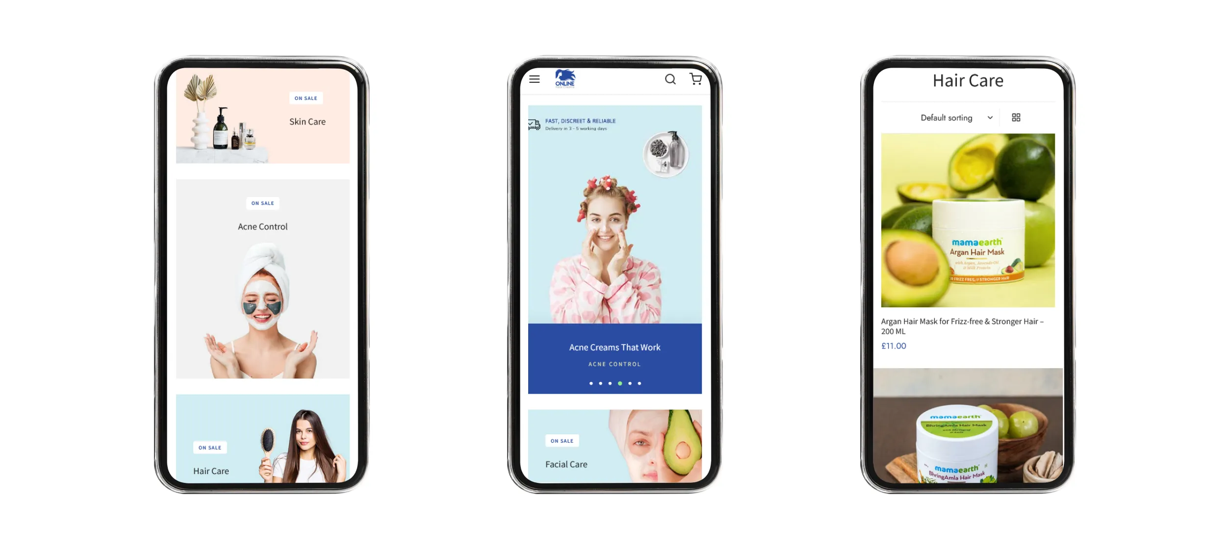
One of the primary concerns I observed was a lack of clear presentation on most of the competitors' websites. Their layouts and color schemes seemed to reflect an outdated design approach reminiscent of the early or mid-2000s. Another significant problem I encountered was the lack of responsiveness on mobile devices. Given that approximately 90% of users access the website via mobile devices, websites must offer seamless and optimized experiences across various screen sizes and resolutions.
By identifying these existing problems, I saw an opportunity to differentiate OFC from its competitors by delivering a super responsive website that enhances the overall user experience.
Solutions
To address the ease of navigation and improve the overall user experience, add minimal graphic banners for each category on the homepage. By displaying these banners, users can easily identify and access specific product categories without the need for extensive navigation. This approach eliminates the need to tap the menu icon and search for specific categories, providing a more seamless browsing experience, particularly for mobile users.
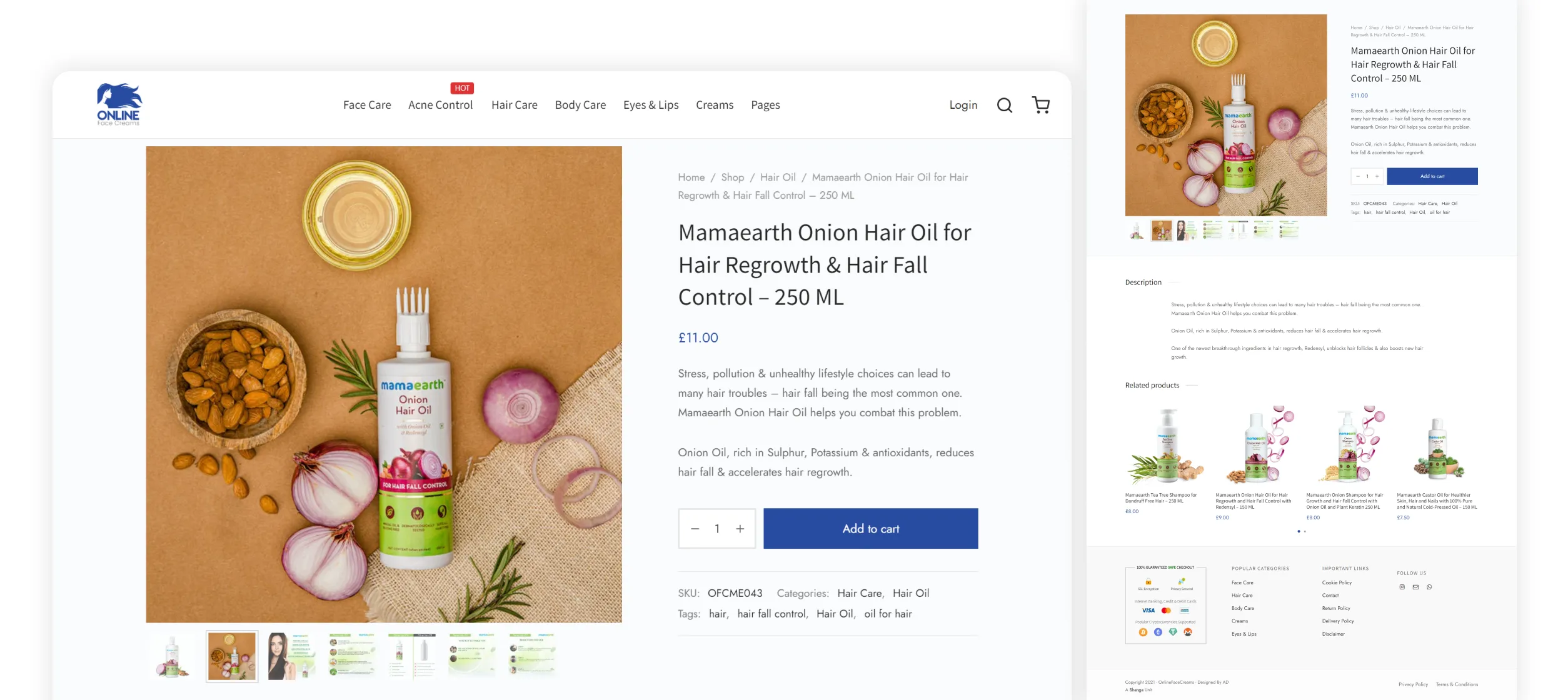
The next thing was to display the product page as simple and clean as possible. Clear product images without any pixelation and a short description of what it does.
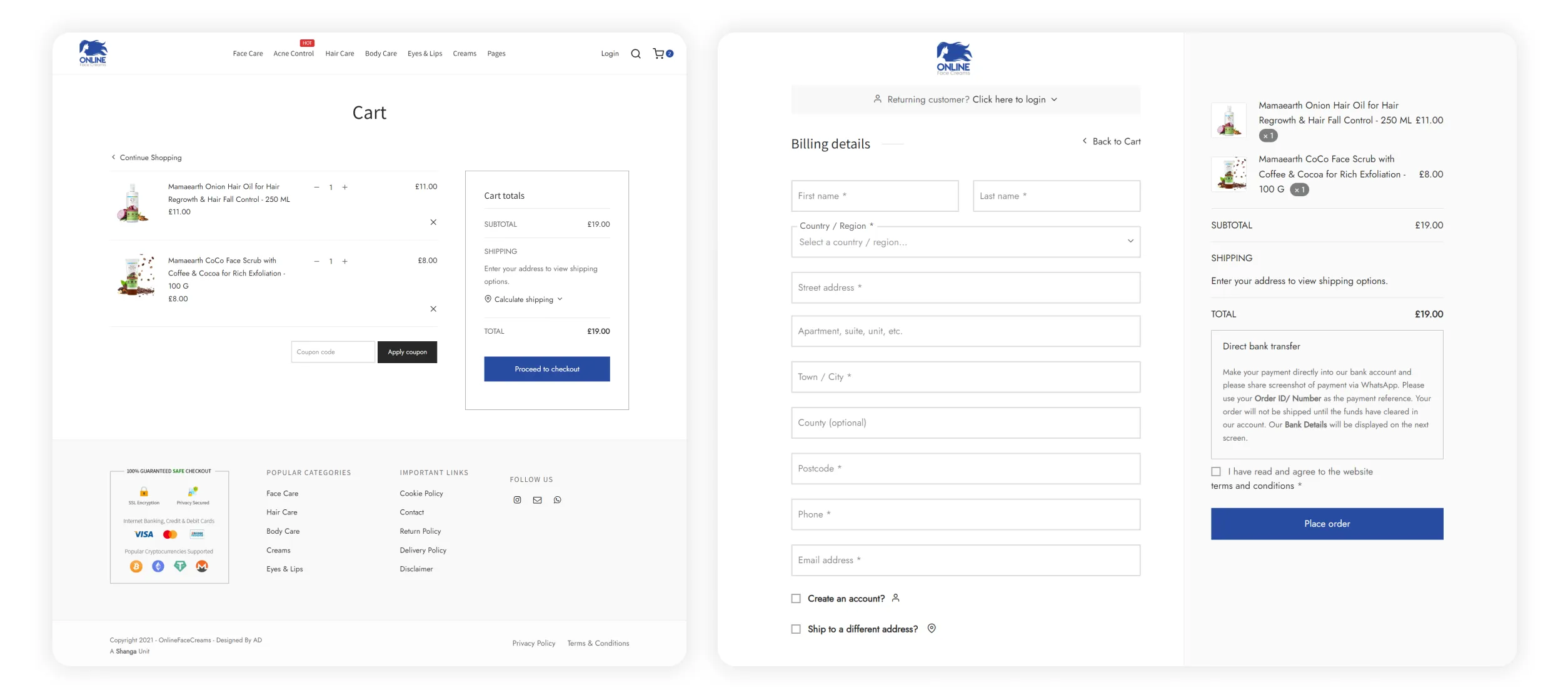
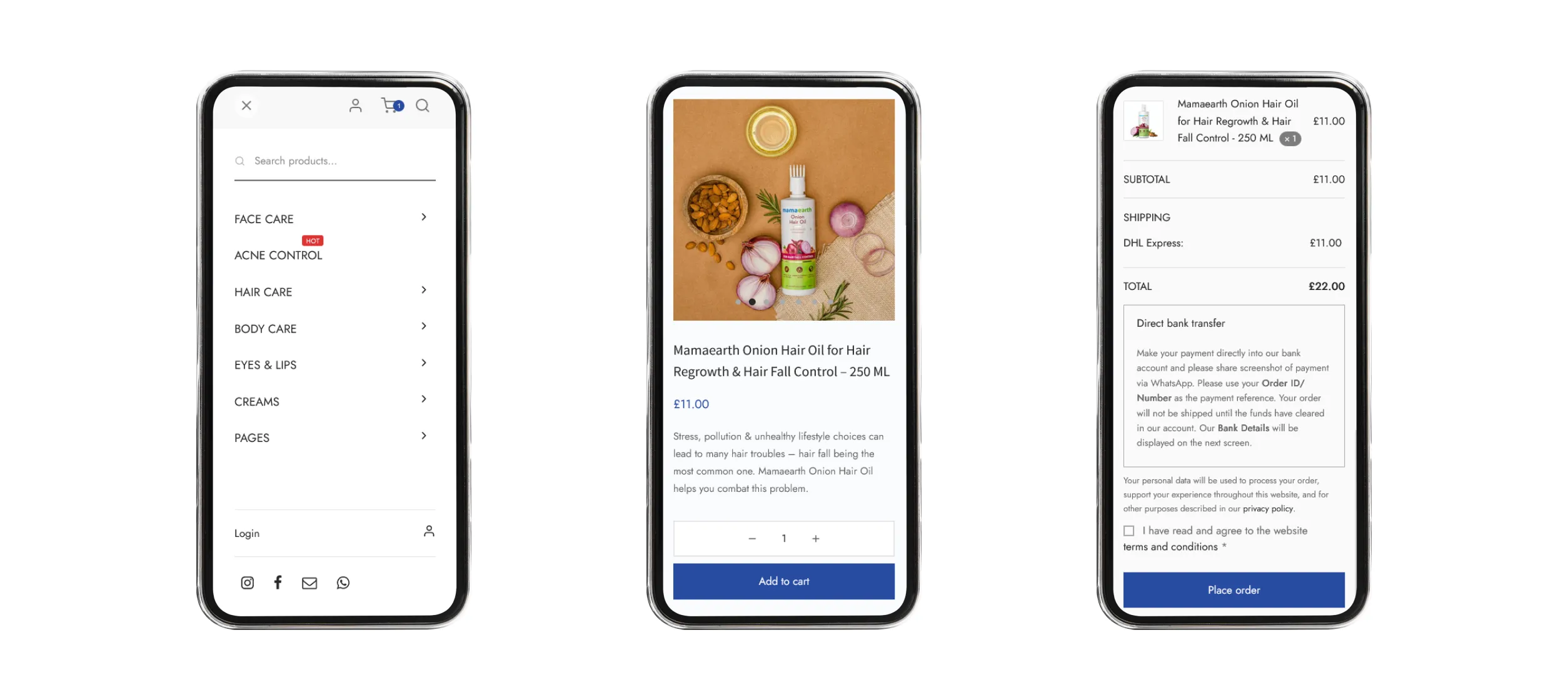
Since there aren’t many details to be collected to make an order for this website, I decided to make the checkout process easier by going with single page checkout. Where the user can log in if the customer is an existing customer who forgot to sign in before adding products to the cart.
Finally making the entire site load super fast and perfectly on mobile devices. Thus making all parts of the site responsive to all devices (particularly the popular viewports in that target market).
Project Goals
Based on the observed data and discussions with my client, we established the following goals
- Implement minimalist-styled banners for each category and sliders on the homepage to enhance the navigation and make it easier for users to find their desired products.
- Create a simple product page that provides a clear description of the product, enabling users to make quick and informed purchasing decisions.
- Develop a streamlined one-page checkout process to optimize the user experience and reduce friction during the purchase journey. Additionally, have the option for guest checkout to allow customers who prefer not to sign up because they might be first-time customers and they might need a couple of orders before they trust OFC to register.
- To boost sales, We decided to introduce a discount system based on quantities (for selective products) to purchase more products by offering discounts that increase with larger quantities.
- Making the overall site super responsive.
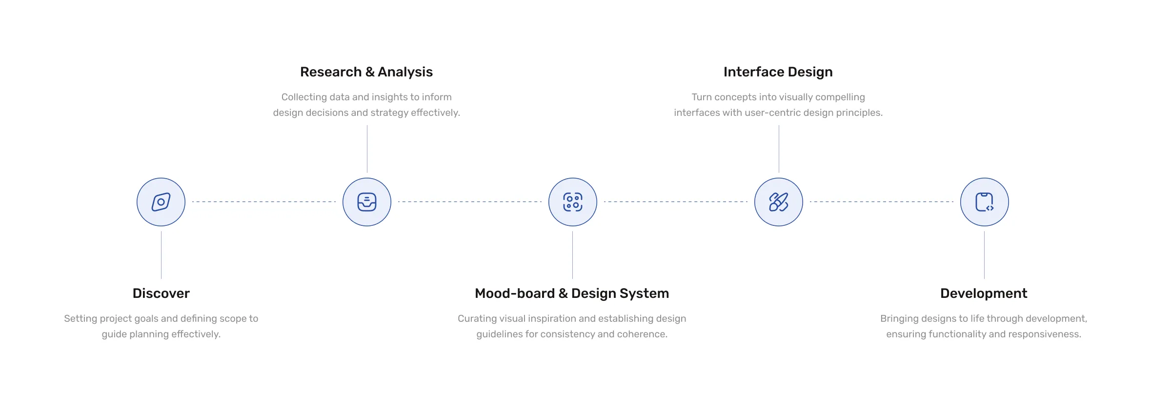
Working Process
After finalizing the project goals, I proceeded to develop basic mockups for key pages such as the homepage and archive page layouts. Using tools like Adobe XD and Photoshop (for banners), I focused on creating a visual representation of the agreed-upon layout.
Given that the website is powered by WooCommerce, I prioritized customization within the established design framework. This involved implementing the desired layout for the homepage, archive, and product pages. Additionally, I dedicated significant effort to resolving layout issues and ensuring optimal mobile responsiveness through extensive CSS modifications.
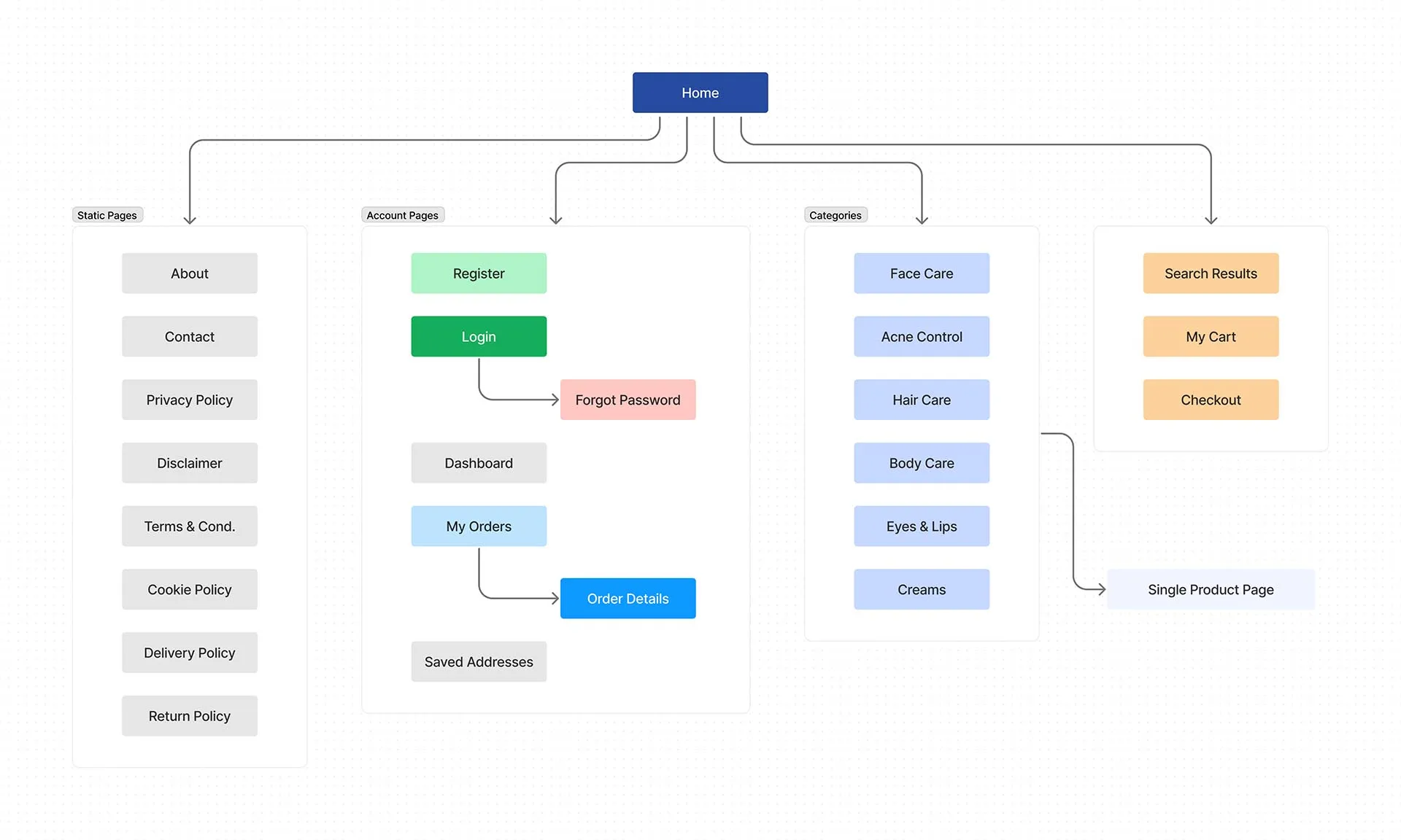
Sitemap
Representation of this website's structure and organization, outlining the hierarchy and navigation flow of pages and content.
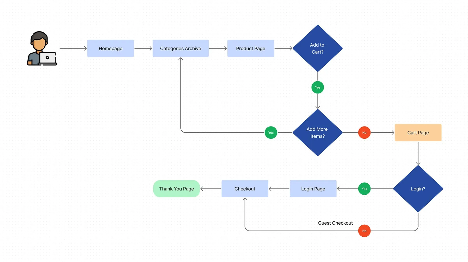
User Flow
Here is a representation of the user's journey and interactions to accomplish tasks on this website.
Website Screenshots

Development
This website was built using WordPress CMS with WooCommerce. I set up the server using Ubuntu OS and installed the necessary PHP and other packages for WP support. Then moved to set up the WooCommerce store and configure attributes, attribute sets, categories, cart rules, shipping zone settings, integrated payment gateway and email SMTP for handling emails. Then I used Elementor and custom CSS (a lot of CSS), I developed the homepage and configured all the other pages according to the mockup and the established design and layout structure.
Finally, To track user metrics and other data, I added Google Tag Manager to integrate Google Analytics, and FB Pixel to track the site’s performance and gather data to further optimize the website. Also, I added NS to the point domain to the host server and added SSL using LetsEncrypt with auto-renewal.
Go to Visuals